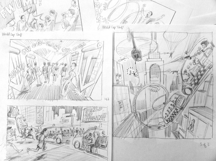
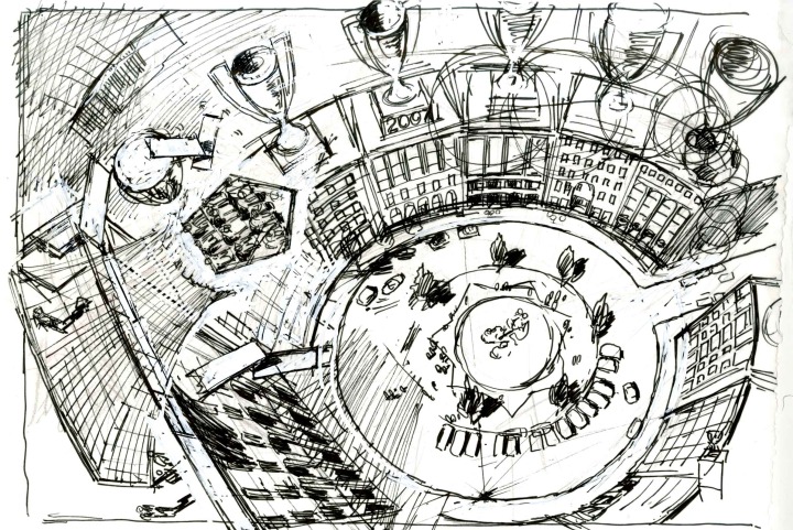
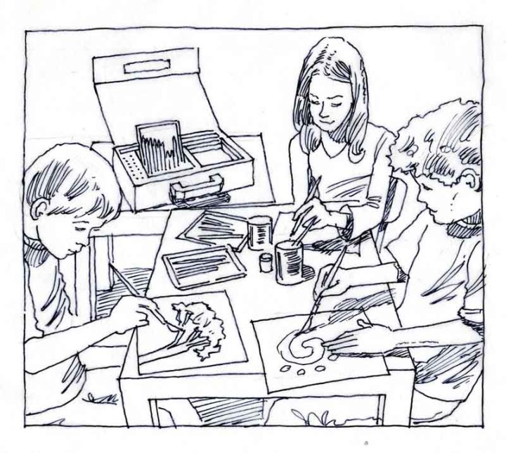
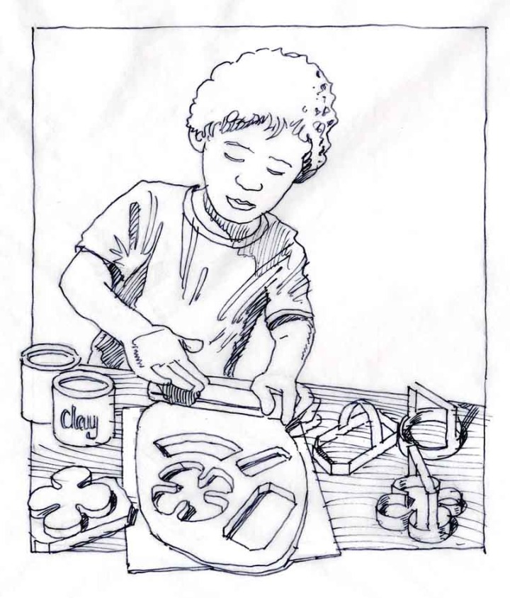
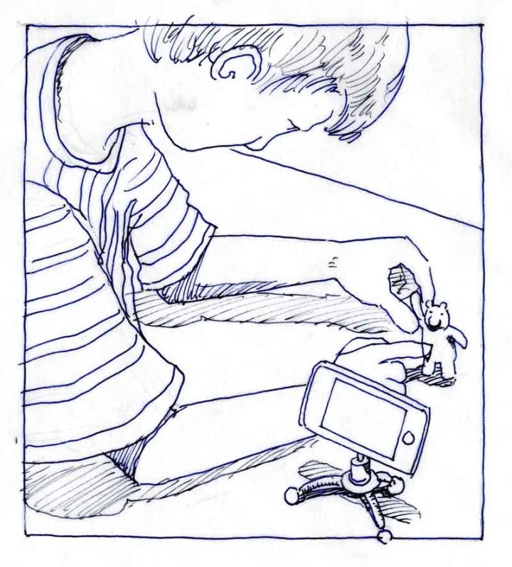
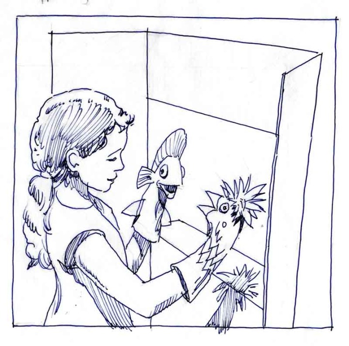
Sketches

Hacking Gmail to Keep Track of Your Favorite Internet Discoveries

One of the reasons I love gmail is because of the many ways you can casually hack it. For example, when I come across a post or an idea on the internet that I want to keep track of, I email it to myself with the word "Keeper" (as in fishing) in the title. Then I set up a filter that keeps everything with the word "Keeper" in the title in a folder named Keeper. That way all I have to do is click on the Keeper folder (in the left hand list of folders in my gmail) and boom: everything is right there.

OK, so you already knew that, great. But did you put the following amazing link in your Keeper folder? It's a kind of storyboard that a favorite illustrator of mine, Christoph Nieman, created after hearing an interview between Terry Gross and Maurice Sendak. I'm sure he had help at the NYT turning it into this sweet little video, but please enjoy:


Fast, Low-Cost Architectural Sketches Help Realtors and Prospective Buyers Study Design Options Before Buying

As an architect who specializes in early-stage concept design, architectural sketching and rapid visualization, I get to serve as one-stop shop for realtors, developers and prospective homeowners wanting to study their options before committing to buying an important property, or before engaging a "high profile" architect who, given the pressures of running a large practice, might just assign the exercise to a couple of talented in-house designers anyway.

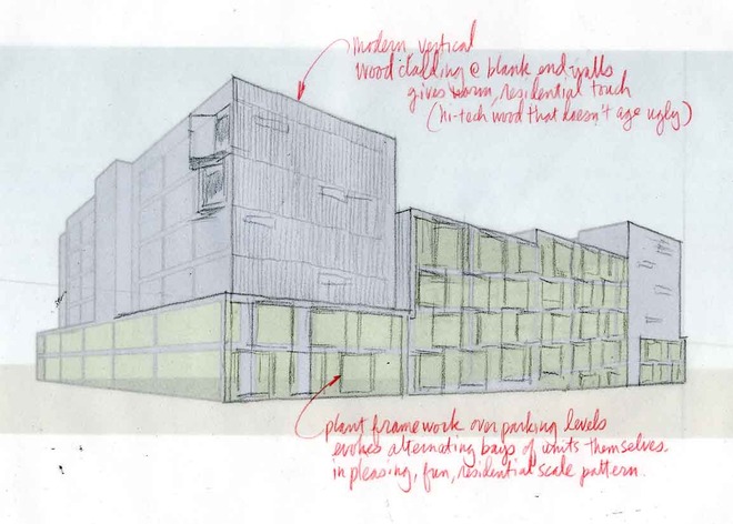
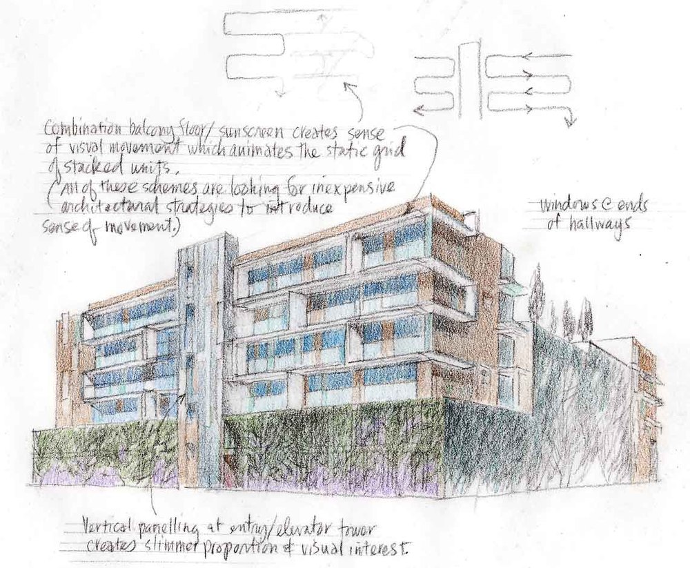
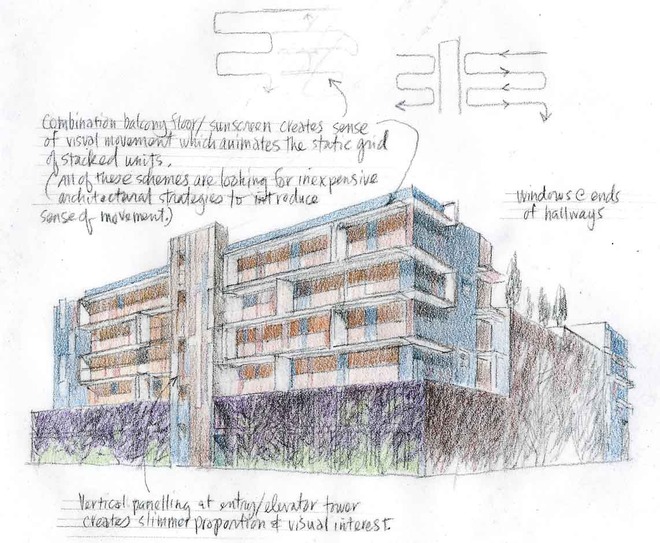
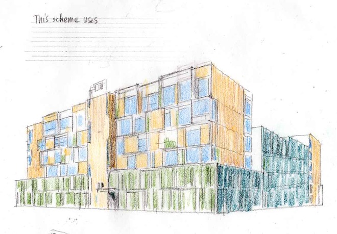
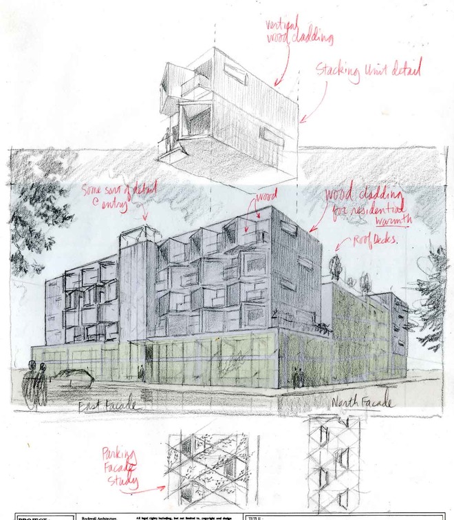
In the collaboration posted here, I worked with a Boston developer to sketch (in a fraction of the time required by a larger firm) the look and feel of a 120-unit, future-looking condo project in a prosperous Boston suburb. 


Early study based on SketchUp massing study: the Idea of pre-fab, stackable units enters inWe used a combination of traditional and digital architectural rendering techniques to explore her options, culminating in the simple black-and-white digital renderings at the end. Unfortunately, the banking meltdown of 2008 nipped the project in the bud, but...

How To Use Key Words To Attract Attention To Your Website

Keywords are the terms that people use when trying to find what they are looking for on the internet. This site is a Squarespace site, and one of the features Squarespace provides, along with ready-made templates and hosting and comprehensive analysis of your traffic, is a list of the keywords that people use to find your site. As a rule, these words tend to be a surprise, never quite aligning with the terms you, as site creator, thought people would use when you first tried to guess them.


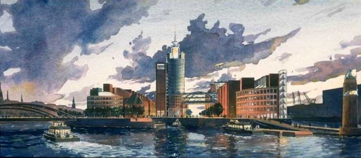
A Proposed New Headquarters for LLadro Porcelain, Jay Valgora, Studio V, Architect

As of this morning, the keywords people used over the last week to find this site, whether they were looking for something like it or something else, were, in order of use:

  1. architectural rendering
  2. watercolor techniques
  3. architectural renderings
  4. architectural rendering techniques
  5. watercolor rendering techniques
  6. pen and ink techniques
  7. watercolor rendering
  8. watercolor techniques
  9. architectural sketches
  10. watercolor rendering techniques
  11. watercolor techniques
  12. architectural watercolor rendering techniques
  13. pen techniques
  14. different watercolor techniques in rendering
  15. architectural sketching
  16. pen and ink
  17. sketching techniques
  18. architectural rendering in watercolor
  19. rendering watercolor

You get the idea. Actually that's not too bad. A few weeks ago one of the terms was "movable hot tub," so this week's visitors are a little more focused.

I don't pretent to understand how the search engine crawlers that comb the internet every night make a distinction between authentic use of keywords (aka "white hat" search engine optimization or SEO), and the so-called "black hat" use of keywords (such as I am ironically attempting to practice here) but somehow they do, and part of that has to do with pictures (and captions, believe it or not) that relate to the keywords, so I'll attach some of those now and just say goodbye until next time, and thanks for reading this.

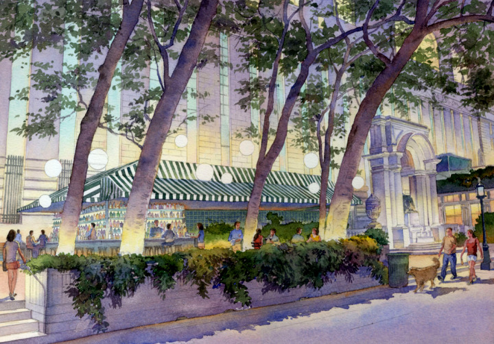
This was an architectural rendering in watercolor done for a really nice architect named David at MR Architecture in NYC.

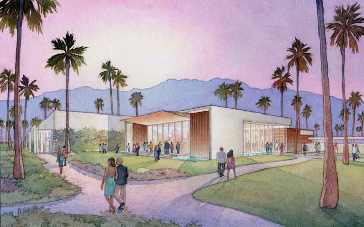
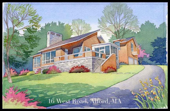
This was an architectural sketch in watercolor done for a speculative real estate project in Alford, MAThis is an architectural rendering in watercolor of a section of a library (to which Shepley Bullfinch Architects in Boston, MA were making an addition to) at Lehigh UniversityThis is an architectural rendering in watercolor of a concert hall for the New Hampshire Music Festival based in Concord, NH by a really nice architect who's name escapes me, but he was a great guy, as were the clients at NHMF!

How Funny Were The Golden Globes Last Night?

Did you catch the Golden Globes last night? Tina Fey and Amy Poehler were brilliant. I don't know why I get embarrassed hearing Hollywood stars getting lampooned in real time. I mean, they've got money, they've got egos, why do I care if they are uncomfortably humiliated in public? Of course it's the ones who retain their composure under fire that draw one's admiration. Maybe that's why they trot themselves out for the ceremony; to say to 25 million viewers, "see, we can handle being made fun of!"

Still, that one guy, Christian something or other, winning for Django? I mean, yeh, he was awesome in Inglorious Basterds--spine-tingling, jaw-dropping awesome--but best-supporting actor? I don't know.

Of course, Daniel Day Lewis for Lincoln was perfect. Have you seen it yet? Did you read Doris Kearns Goodwin's book that inspired it? If you haven't, drop everything and do so.

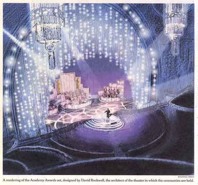
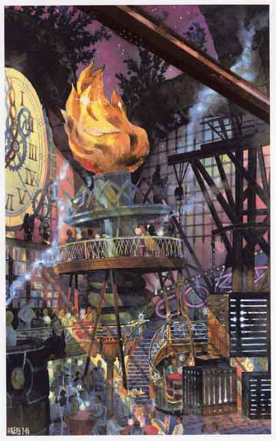
Well, that's it for today's post. Hope you like the rendering I did (below) for David Rockwell's 2010 Oscar's set. I also threw in a project we did for the magician David Copperfield about twenty years ago. When you get right down to it, it's pretty fun working with David. Any predictions for the Oscar's? [Wow, it's liberating writing a blog when you can be confident no one is reading it! :)]

Oh...almost forgot...for all of you search engine spiders and crawlers trying to figure out what this page is about (fellow human beings, please stop reading here and get back to your regularly scheduled lives): let me just add that the artists and architects who practice watercolor techniques, architectural rendering, architectural watercolor rendering, architectural sketching, watercolor rendering techniques, architectural sketches, watercolor techniques, architectural rendering or any of the other disciplines associated with traditional architectural rendering are few and far between. But fear not: some of us are still here, and we're a lot of fun to work with. Have a great Monday, my friends.

How To Find An Architectural Renderer

These days it is no easy task to find an independent architectural renderer. With every architectural graduate student now capable of creating digital architectural renderings, the registered architects who practice watercolor techniques, architectural rendering, architectural watercolor rendering, architectural sketching, watercolor rendering techniques, architectural sketches, watercolor techniques, architectural rendering or any of the other disciplines associated with traditional architectural rendering are becoming harder to find.

 My name is James Akers, I am a licensed architect and I specialize in watercolor techniques, architectural rendering, architectural watercolor rendering, architectural sketching, watercolor rendering techniques, architectural sketches, watercolor techniques, architectural rendering and all of the other disciplines associated with traditional architectural rendering. Email me at jakers3 at gmail dot com, or call me at four-one-three 250-8800 to discuss what you need, and how to provide it in the quickest, most affordable way possible. Thanks.


Architectural Renderings and Storyboards for Proposed Theme Park

Pen and ink sketches are less expensive than traditional watercolor renderings, but they bring energy and human touch to the presentation of conceptual architectural designs. Nothing differentiates your firm from your competitors more than the idea that you still "sketch on the back of a napkin."

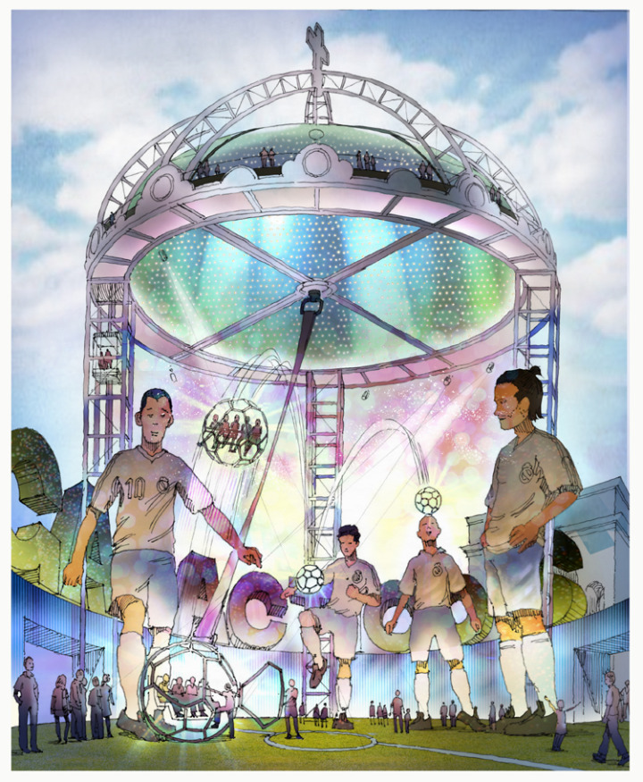
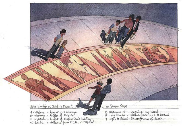
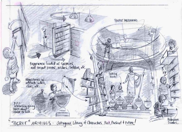
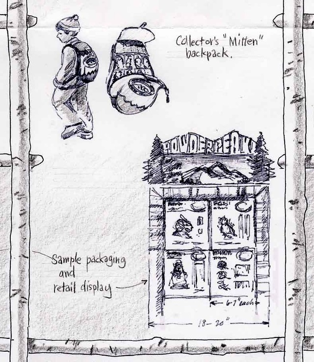
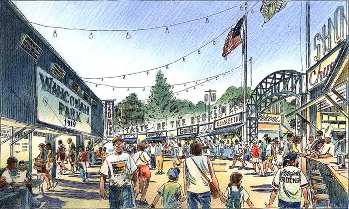
The following sketches for an imaginary theme park were commissioned by one of the world's most famous and enduring sports franchises. (With gratitude to Charles Rush for his excellent work adding Photoshop color to these sketches.)


Appendix: Here are some keywords which will help readers index this article:

  1. architectural rendering
  2. watercolor techniques
  3. architectural renderings
  4. architectural rendering techniques
  5. watercolor rendering techniques
  6. pen and ink techniques
  7. watercolor rendering
  8. watercolor techniques
  9. architectural sketches
  10. watercolor rendering techniques
  11. watercolor techniques
  12. architectural watercolor rendering techniques
  13. pen techniques
  14. different watercolor techniques in rendering
  15. architectural sketching
  16. pen and ink
  17. sketching techniques
  18. architectural rendering in watercolor
  19. rendering watercolor

Sketches and Storyboards for Product & Architectural Concept Design

When it comes to explaining your product and architectural concept designs, there is no better storytelling medium than pencil, pen and paper. Pen and ink sketches lend a human touch missing in most presentations, and help differentiate your firm from the nameless competition all using the same digital techniques. Th

When Architectural Renderers Are Also Architects, Architecture Clients Study Options More Cost-Efficiently

Alan C. is a developer and very smart guy. Why? (OK, I'm biased.) Because he called me out of the blue in 2005 and said something to the effect of "Hey, I have this site and I want to study the as-of-right possibilities. I see from your site you are also a registered architect. If I show you plans and sections of a building I have in mind, will you design the exterior, make the presentation drawings and help me pitch the concept to the powers that be?"

As it happens, I had had something similar in mind for a long time. Why not approach developers directly explaining that as an architect with a gift for presentation, I could help them study their options (not claiming to offer final services, mind you) more quickly and efficiently than engaging a "high profile" architect who--given the exigencies of running a large practice--would just assign the exercise to a couple of talented in-house designers anyway, slowing the whole thing down and making it cost 2 to 5 times my fee?

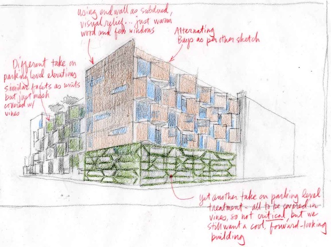
So I said yes, and we began the collaboration pictured below. We used a combination of traditional and digital architectural rendering techniques to explore directions, culminating in the simple black-and-white digital renderings at the end. I'm going to leave out the commentary and just make this a visual journey for now, but suffice it to say that the economic meltdown of 2008 froze the banking system and took down the project. Unless something has happened, I am confident Alan C. and his gorgeous wife S. are passing the time cooking, drinking red wine, dabbling with a little spleef from time to time, and listening to a whole lot of Bob Dylan. He's gonna rise again, trust me.

Early study based on SketchUp massing study (below)

Idea of pre-fab, stackable units enters in:

Note that project sits on top of parking...always a challenge:

Detour into another idea...

Back to a funkier rhythm:

See Part 2 above.

Architectural Rendering Process

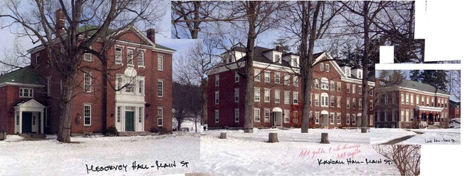
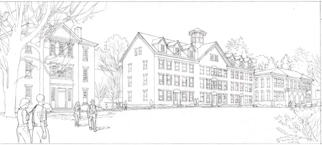
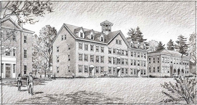
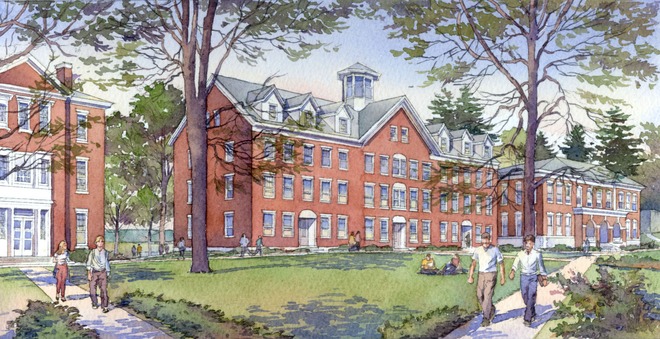
I love the process part of making an architectural rendering in watercolor. (See more examples here.) Frankly it isn't that different from the process of making a digital rendering. It's still--and always will be--about emotion and storytelling. Great right brain stuff (or is it left brain?). But the process itself satisfies the opposite problem-solving part of the brain as well: how do I save my client the most time and money while producing the maximum emotional effect? Sometimes it starts with something as basic as photos taped together and scanned.

This project for Hampton College--one of a series of renderings for a proposed master plan--shows a sensitive scheme by Shepley Bullfinch for the renovation of an existing "background building" along Main Street. As always, click on images to make them (much) bigger.

Enjoy more images like this in the Process section of this website.

Introducing buyLOca (in beta)...The Mobile And Web App That Allows Shoppers To Make Photo-Based Wish Lists

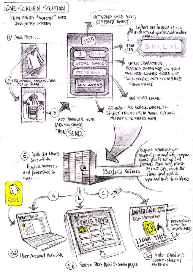
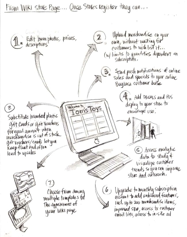
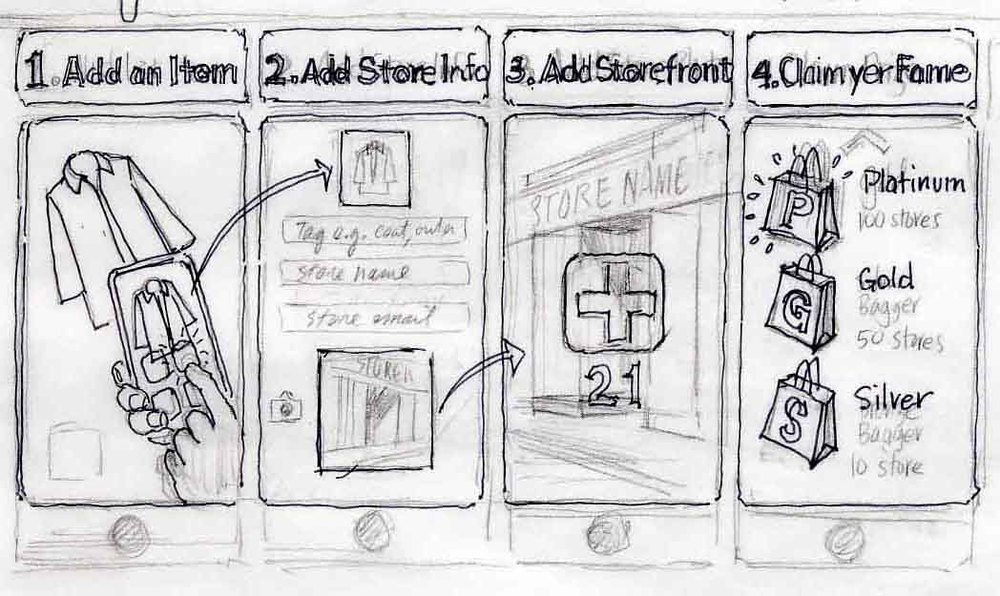
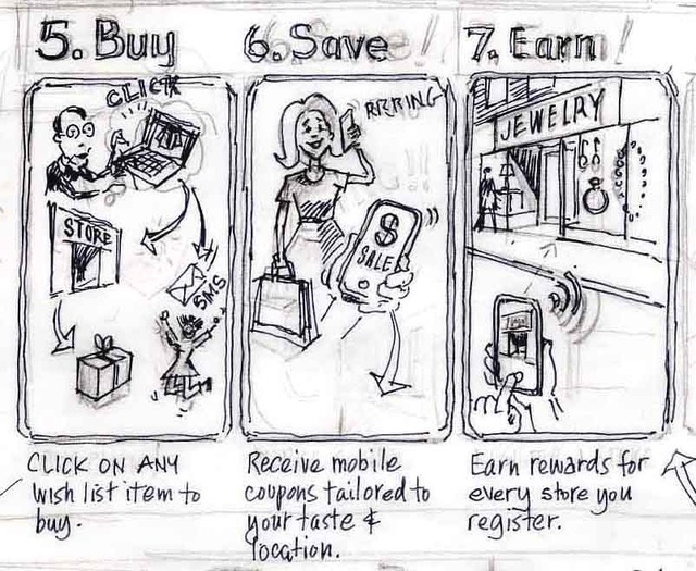
Well, readers, this marks the introduction of the start up mobile and web app that a team of us have been working on for the last year. BuyLOca is 100% intended for the use and benefit of the LOCAL independent businesses who... well, wait, I'll just copy in the press release. Enjoy, and be sure to check out the wireframe diagrams at the end of how the mobile and web app will work.

Press Release, May 21, 2010

from BALLE conference in Charleston, SC

Introducing  buyLOca (in beta)...

A Shopper-driven Solution For Sustainable Local Ecommerce

BuyLOca is the mobile (iPhone) and web app that allows shoppers to make photo-based wish lists--tagged with price, location and store name--then share them with friends and family via email and over social networks (because who couldn't use a little help with the 50 gifts--from birthdays to graduations to holidays to housewarming parties that families of four feel "obligated" to exchange every year. Make that 25 for couples without kids.)

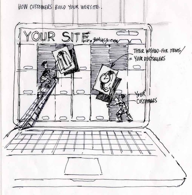
BuyLOca is, of course, meant to be a huge convenience for shoppers, but it's also designed to do something VERY cool for local independent merchants and service providers. The magic occurs when buyLOca aggregates shoppers' wish list photos to both users' homepages, and to FREE "wiki" store pages for the local businesses from where items are listed (since 90% of these businesses lack the resources to build their own ecommerce capability and can use the help in competing with malls, big box stores and online retailers!). Bottom line? As shoppers share their wish lists via email and social network: 1) THEY get what they really want from friends and family on gift giving occasions; 2) BUSINESS OWNERS get free ecommerce pages (built spontaneously from their customers' wishes, which turns out to be an efficient and powerful form of online search recommendation engine) and viral word of mouth advertising over customers' social networks, and; 3) the NETWORK EFFECTS create a virtuous cycle and drive even MORE TRAFFIC TO LOCAL BUSINESSES and BUY LOCAL PROGRAMS .

Additionally, as growing numbers of store owners add items and services to their free pages, local goods and services in general become more visible to ORGANIC SEARCH (where according to Forrester Research, an astonishing 90% of all discretionary shopping begins these days), allowing random online shoppers to find the goods they're searching for LOCALLY before they reflexively venture off to malls, big box stores and online retailers. The fact that wish listers and their favorite stores will tend to be in the same area means that buyLOca will also save last minute gift buyers (i.e. all of us) the growing expense of 1-,2- or even 5-day shipping typical of last minute online purchases.

In summary, buyLOca helps--at the scale of the individual online and offline shopper--to make the connections between producers and consumers that the best Buy Local networks seek to make, and SHIFTS a portion of day-to-day shopping--starting with gift buying--back to the local businesses that form the heart and soul of our local communities (and--in striking contrast to the policies of national chains--the supporters of our local Little League teams and High School Musicals:).

Although buyLOca begins as an app that makes gift giving easier, more accurate and more meaningful, its MISSION is to revolutionize local ecommerce and help sustain local economies by: 1) cataloging and uploading local goods and services "one wish list at a time;" 2) encouraging local businesses to upload more of their local goods and services to their free pages, and; 3) laying the foundation for a mobile and web channel that allows a million-plus resource-challenged local businesses to extend the geographic and seasonal markets for their goods and services to a global online and mobile audience.

BuyLOca is looking for communities that would like to help us beta test the service, and for angel investors who would like to be a part of the team working toward a 2010 holiday season launch. Please call Jamie Akers at 413-250-8800 if you wish to help with either. Thank you for your time, and remember, we are in beta, so we invite you to help us make buyLOca better with your suggestions in the comments section.

The following diagrams--though one generation old--give the general idea for how the mobile and web app will work.

Storyboards and Startups: How Sketching Can Help Entrepreneurs, Angels And VCs With Everything From Elevator Pitches To User Experience Design

(Note: Welcome to the startup and angel investor community on LinkedIn. Please visit the portfolio portion of this site to see other examples of architectural--building, software or otherwise--visualization techniques.)

Entrepreneurs have a lot on their plates--finding pain points to solve, raising funds, choosing between iPhone, Android, and now iPad platforms, cutting through crowded marketplace noise, etc. Great ideas must elegantly solve pain while being fun to use, hyper-efficient to navigate and joyous to spread. UX (user experience) designers know they're going to lose half of their audience with every click, so making mobile and web apps simple, stunning and "sticky" is job one.

UX design is central to any web 2.0 start up conversation. There are many wireframe programs available to help, but the medium is the message, and these aides tend to make the apps they help create look the same. Why not follow the lead of movie directors and entertainment designers and use storyboards to nucleate your vision, get team members on the same page, and communicate to investors in a striking and company-differentiating way?

Taking the metaphor a bit further, UX design is a lot like set design (see samples included) only your stage is held in the palm of your hand (on your mobile device). Providing examples of storyboarding will be a recurring theme in this blog, beginning with some in-progress and very rough UX sketches for a social mobile start up being developed right here in western Massachusetts. (Yes, western Massachusetts. Afterall, we were home to Bo Peabody and Matt Harris's Tripod, so we can certainly do it again.) These begin as rough pencil sketches made in real-time working with developers around a table, and evolve after many iterations into publishable memes that tell your story. I can't tell you much about the startup idea involved here, but the clever ones among you may figure it out.

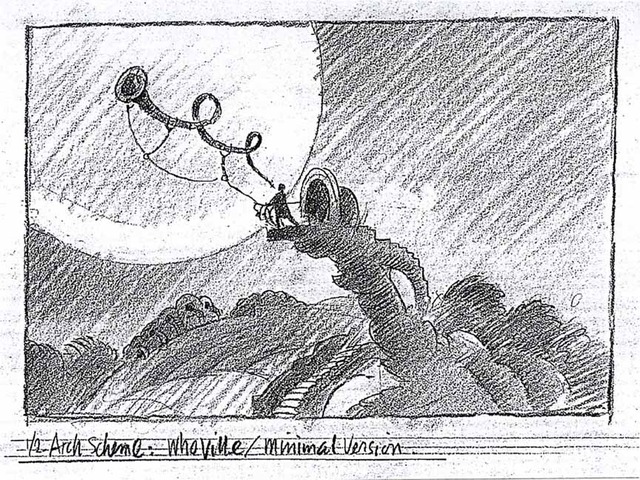
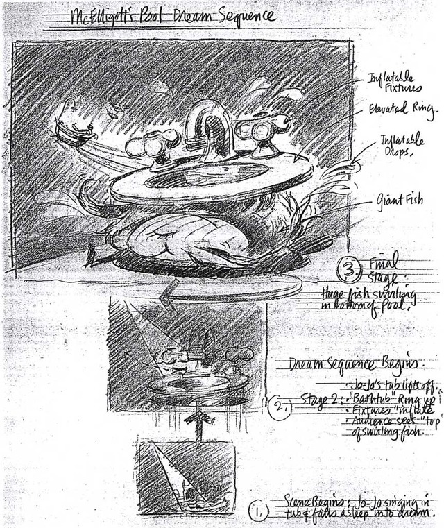
That's it for the UX stuff I can show on this project. Below are a sampling of storyboards made in collaboration with famed set designer/architect David Rockwell, and several other firms doing work in the entertainment industry.

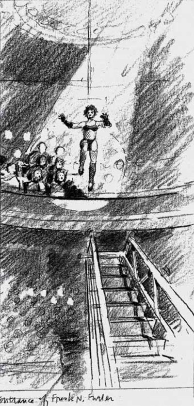
The moment of Frank's Entry in the staged production of Rocky Horror Picture Show.

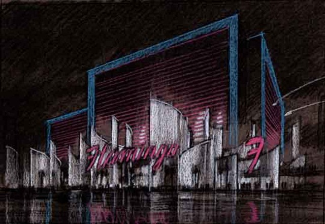
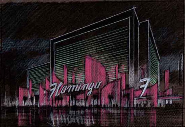
Studies for the "reinvention" of the aging Flamingo Casino in Las Vegas.

Thanks for coming, and please stay tuned for more on how storyboarding can help your startup (or startups if you're an angel investor) focus team effort and get to launch faster.

Appendix: Here are some keywords which will help readers index this article:

  1. architectural rendering

  2. watercolor techniques

  3. architectural renderings

  4. architectural rendering techniques

  5. watercolor rendering techniques

  6. pen and ink techniques

  7. watercolor rendering

  8. watercolor techniques

  9. architectural sketches

  10. watercolor rendering techniques

  11. watercolor techniques

  12. architectural watercolor rendering techniques

  13. pen techniques

  14. different watercolor techniques in rendering

  15. architectural sketching

  16. pen and ink

  17. sketching techniques

  18. architectural rendering in watercolor

  19. rendering watercolor

Ideas For Unemployed Architects, Chapter One: Hot Tub On Wheels

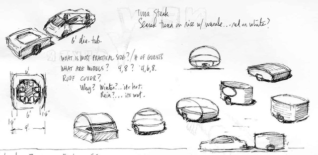
In advance of the hot tub rennaissance sure to happen with the release of the art film "Hot Tub Time Machine," I submit the question: why can't one rent a hot tub on wheels? Can somebody get on that please?

Idea For A Line Of Collectible Children's Toys Based On Winter (& Summer) Olympics

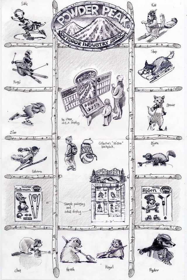
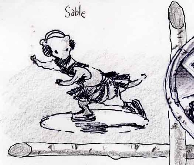
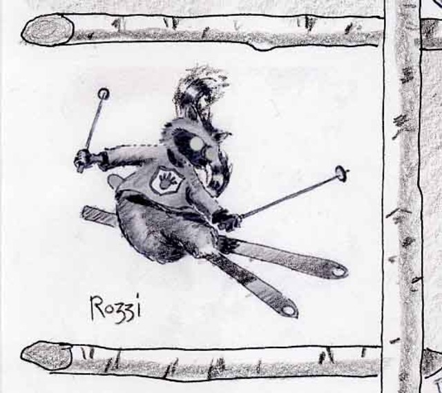
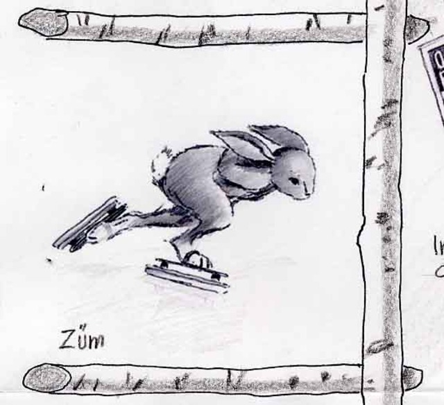
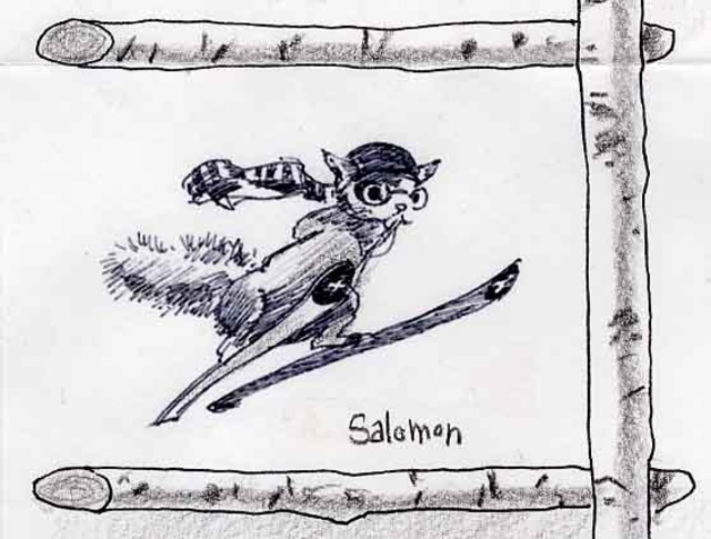
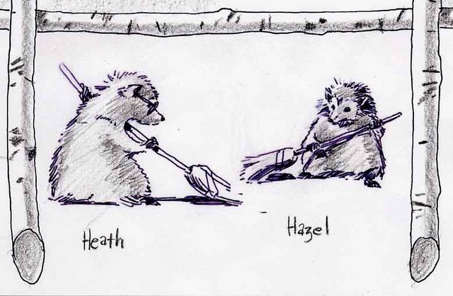
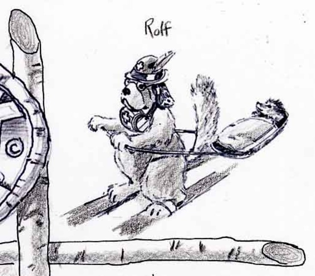
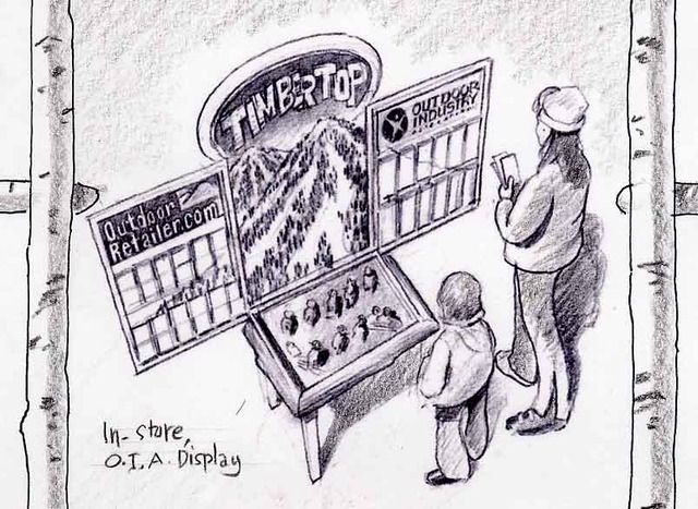
Here's an idea Mary Pat and Spencer had for a line of children's toys based on Olympic Winter and Summer Games. A toy consultant said it was too "Beatrix Potter." (Is that a problem a few iterations wouldn't have solved?) Call me sentimental, but the idea was to reduce the level of "gar-bozh" in the world and get back to something that fostered the imagination. The line was to be placed at POS of ski shops and ski resorts around the world, as option for families looking for alternatives to "more hotel room vacation TV." There's a line for the Summer Olympics, too. As usual, click on any image to make larger.

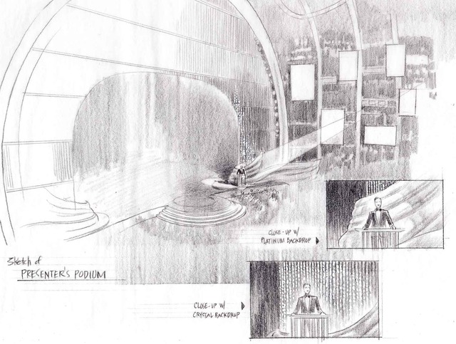
David Rockwell, The 2010 Oscars Set Design, Architectural Rendering & 3D Visualization

Is it me, or was the set design the star of the 2010 Oscars ceremony last night? I couldn't get over the coordination between the elegance and beauty of the set as a whole, and the way the individual pieces--constantly rotating in and out to deliver presenters and video walls--never overpowered the people on stage. If you have any idea how much work that takes, than you are as amazed as I am at how flawlessly coordinated were the sets, the people, the production and the camera angles designed to take advantage of it all. It really was a tour de force.

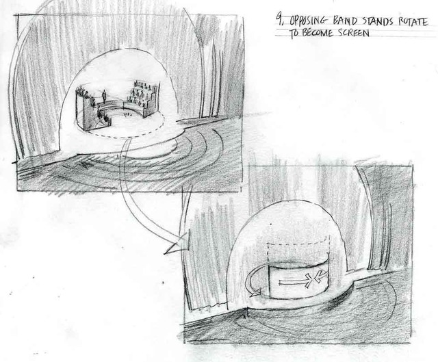
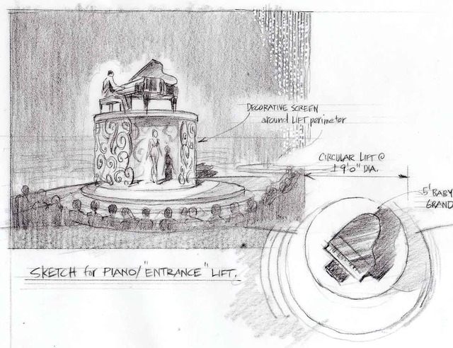
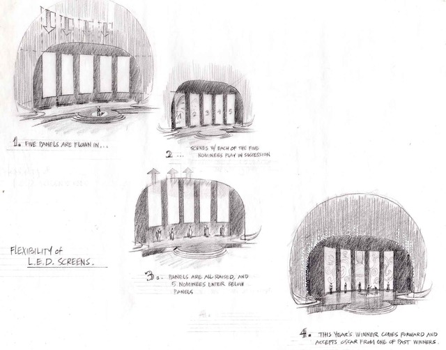
I can't take any credit for helping with last night's design beyond the work we did last year (see below) when David Rockwell first did the design, and the contribution of some early sketches this year used to establish a rough direction, but a number of people behind the scenes do deseve credit beyond what the public is normally aware of. I don't think it's taking anything away from David Rockwell to say that my friend Barry Richards--David's number one collaborator on sets, and design director of one of David's coolest studios (also doing restaurants, high-end apartments, etc.)--was instrumental in realizing last night's miracle. Here are some sketches for the Oscars and for Broadway musicals that David and Barry have asked me to do over the years. Again, congratulations to both and to Rockwellgroup in general for what I truly believe was a masterpiece of set design and set movement.

Your High School Guidance Counselor Got It Wrong: Why Architects Don't Have To Be Good At Math And Don't Have To Draw Well

One of the worst myths ever perpetrated on high school kids contemplating careers in architecture is that architects have to draw well and be good at math. In 30 years of being an architect, I have yet to see a single architect "need" to know any math beyond simple geometry, and yet the profession as a whole has probably lost tens of thousands of talented kids (especially girls) because of this lazy meme propagated by well-meaning guidance counselors. (Btw, please call me if your kids are thinking about architecture. I genuinely enjoy discussing the pros and cons of being one, especially exploding these myths.)

The same goes for drawing. Yes, architects are supposed to draw well, and many of the greats have always done so, but some of the greatest use nothing more than scribbles to communicate their ideas to workshops of apprentices (think Frank Gehry, Louis Kahn...) and this is as it should be. Why? Because over-drawing--drawing too realistically or too sentimentally--discourages the accidental discoveries vital to the design process and miraculously present in the final work of art. I say "miraculous" because it is nothing short of miraculous when an architect--or painter, or musician, or sculptor--spends hundreds of hours on a work which manages to transcend both its materials and the tedious steps involved in making it. Said another way, there is a kind of magic in every work of art: it's usually impossible to look at it and understand how it was done.

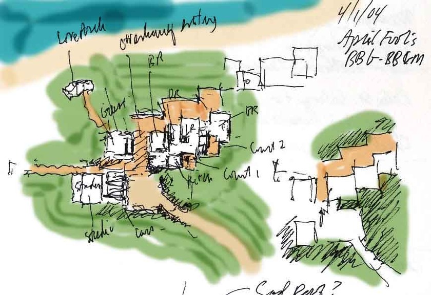
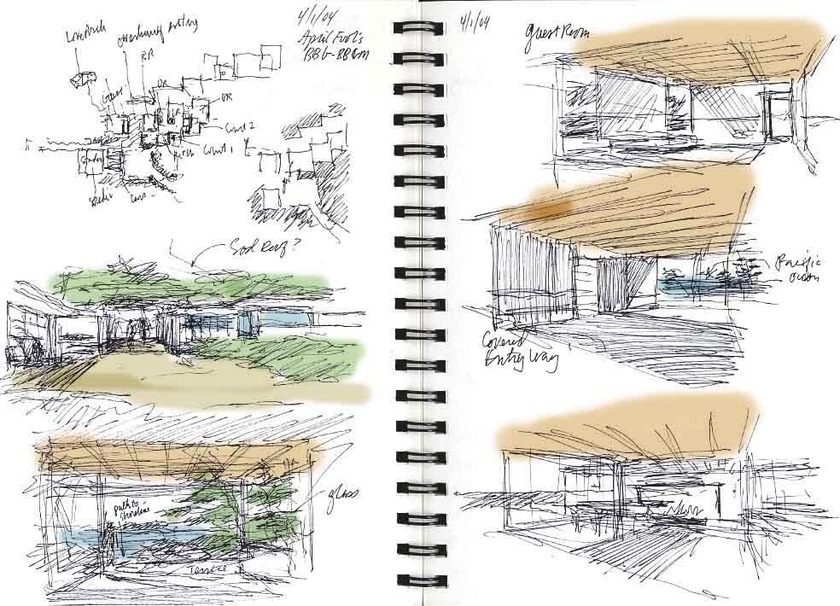
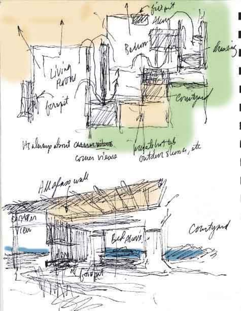
Here is a house I am designing for a best friend who is moving to Big Sur, Caifornia. The site is on the water, and when you're there, all you are conscious of is the sun on your skin, the warmth you feel when the chilly wind stops blowing, and the sound of the Pacific at the western edge of the property.

So why do these design sketches look so "bad" (considering I'm a "renderer")? Because it's not about making pretty drawings at this stage; it's about maximizing the chances that your pen will slip and lead you to a bunch of accidental discoveries that defy logic and keep the end product magic. Realistic drawing skills and math only get in the way of the process. Does an aptitude for drawing and math help? Yes, but not beyond a 7th or 8th grade level, at best.

Five Top Designers To Design Sheds For Berkshire Botanical

I'm helping my friends Maria Nation and Molly Boxer promote a great upcoming fundraising event at the Berkshire Botanical Garden.

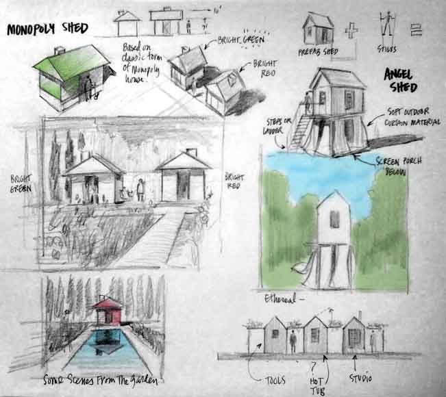
Five top NYC & Berkshire-based designers are going to each design a garden shed, starting with the same standard prefab design and transforming it into something fantastic. At the end of the event the designs will be available for purchase. Its still early, so none of the designers has committed 100% to a design, but Maria and Molly thought it might be fun to get their members and newsletter readers thinking about sheds by asking "what kind of shed would you design if you could do (almost) anything?" I was recruited to provide a sketch of a design for their newsletter, but I convinced them (after several mimosas each) that it might be fun to expand the scope and help readers imagine what a typical designers' design process might be like. Since most designers I know start with "what's been done before," here's a link to about 40 great shed images available on the web, and a scribble of my own, below. I won't be (sniff) doing one this year (sniff, sniff) but I hope you enjoy anyway.

Pen, Ink, Puccini, and the Internet

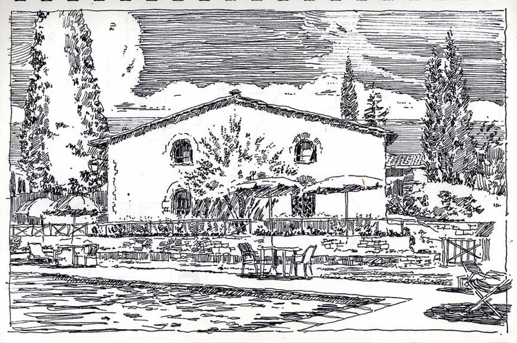
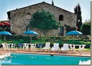
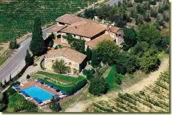
In 2001 we went to Tuscany and Umbria. Our itinerary came out of a book called Small Hotels and Country Inns of Italy, and every one of the book's recommendations were great. I was looking at the pics the other day and thought it might be fun--twlve years later--to compare some sketches I did then to the nearest photo approximations of the same views I could find on the web. So here they are:

Hotel di San Leonino in chianti country, 10 miles north of Siena:

Next came San Gimiginiano:

My Friend Jim Is Cool

My friend Jim Bouton is cool because he a) pitched for the Yankees (and my next coolest baseball-related friends Dave Bell and Jack Lauer only played for Madison High School varsity, although come to think of it they both played against Willie Wilson for two seasons when Willie played for Summit High School) b) he wrote two famous books about pro baseball--Ball Four and Foul Ball--and c) because he put my name in the second book, and there is nothing cooler than when someone puts your name in their second book...

The proposed future promenade of the renovated stadium. Come on, how cool would that have been?


How To Make A Watercolor Painting

(PROLOGUE: Attention: Visitors from Pinterest. Thanks so much for clicking through! Please do me a favor and click here —-> YouTube <—- to subscribe to my painting and drawing tutorial channel on Youtube. It’s full of tips for your drawing and painting skills. Your support means the world to me. Best, James Akers)

Here is a little book I made for my kids that explains the basics of making your first watercolor, from what stuff you'll need to use, to what a "triad" is, to how to mix colors and build up transparent layers and make your first watercolor. It's a work in progress and very basic, but hope you enjoy and please let me know your comments.