Alan C. is a developer and very smart guy. Why? (OK, I'm biased.) Because he called me out of the blue in 2005 and said something to the effect of "Hey, I have this site and I want to study the as-of-right possibilities. I see from your site you are also a registered architect. If I show you plans and sections of a building I have in mind, will you design the exterior, make the presentation drawings and help me pitch the concept to the powers that be?"
As it happens, I had had something similar in mind for a long time. Why not approach developers directly explaining that as an architect with a gift for presentation, I could help them study their options (not claiming to offer final services, mind you) more quickly and efficiently than engaging a "high profile" architect who--given the exigencies of running a large practice--would just assign the exercise to a couple of talented in-house designers anyway, slowing the whole thing down and making it cost 2 to 5 times my fee?
So I said yes, and we began the collaboration pictured below. We used a combination of traditional and digital architectural rendering techniques to explore directions, culminating in the simple black-and-white digital renderings at the end. I'm going to leave out the commentary and just make this a visual journey for now, but suffice it to say that the economic meltdown of 2008 froze the banking system and took down the project. Unless something has happened, I am confident Alan C. and his gorgeous wife S. are passing the time cooking, drinking red wine, dabbling with a little spleef from time to time, and listening to a whole lot of Bob Dylan. He's gonna rise again, trust me.
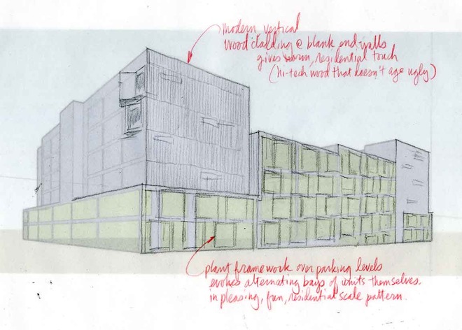
Early study based on SketchUp massing study (below)
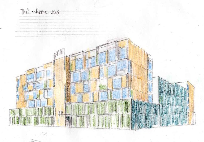
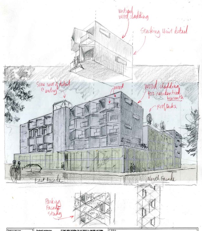
Idea of pre-fab, stackable units enters in:

Note that project sits on top of parking...always a challenge:
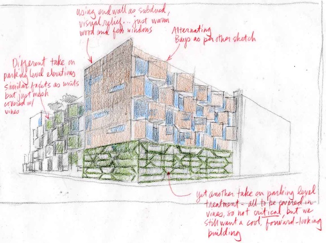
Detour into another idea...
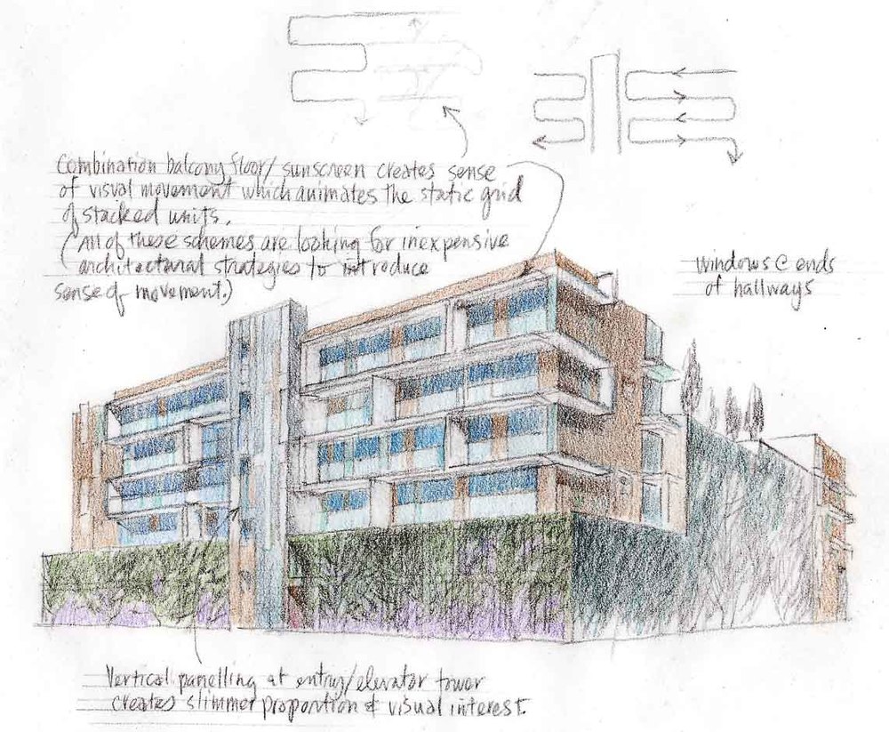
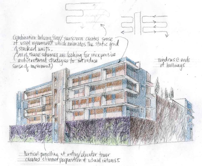
Back to a funkier rhythm:
See Part 2 above.