It delivers a world of infinite convenience and selection to our fingertips...
Can architects and designers *really* design in Procreate, or is it just a glorified digital sketchbook? In today's tutorial for architects, designers and students, I demonstrate the "super powers" of Procreate that make it the ideal choice to imagine your design, develop it in scale, then hand it off for further development in Rhino or Sketchup. What makes Procreate such a powerful design tool is that it combines the best of both worlds…
Good things really do happen when you expect them the least.
For years I’ve been on the lookout for good ways to explain the advantages of designing and rendering by hand with Procreate, versus traditional designing and rendering by hand with pencil on paper. I haven't found the exact right words yet, but I keep looking.
Then this morning I woke up and saw on Twitter that the cartoonist Gary Larson was starting to cartoon again. He retired from drawing "The Dark Side" about 10 years ago, but according to this announcement he was starting to draw again-- for fun. Not the deadline-based, cartooning with which he entertained the world for 15 years, but drawing for his own amusement. Naturally my interest was peeked! But then it got better.
In today's masterclass, I show you how quick gestures with Procreate brushes can be all you need to create compelling concept design renderings full of life and energy
In today's masterclass, I show you how designing with sketches can give your ideas the time and attention they need to grow, bringing your client into the creative process, as opposed to shutting them out with the false promise of half-baked photorealistic concept designs.
It delivers a world of infinite convenience and selection to our fingertips...
Pen and ink sketches are less expensive than traditional watercolor renderings, but they bring energy and human touch to the presentation of conceptual architectural designs. Nothing differentiates your firm from your competitors more than the idea that you still "sketch on the back of a napkin."
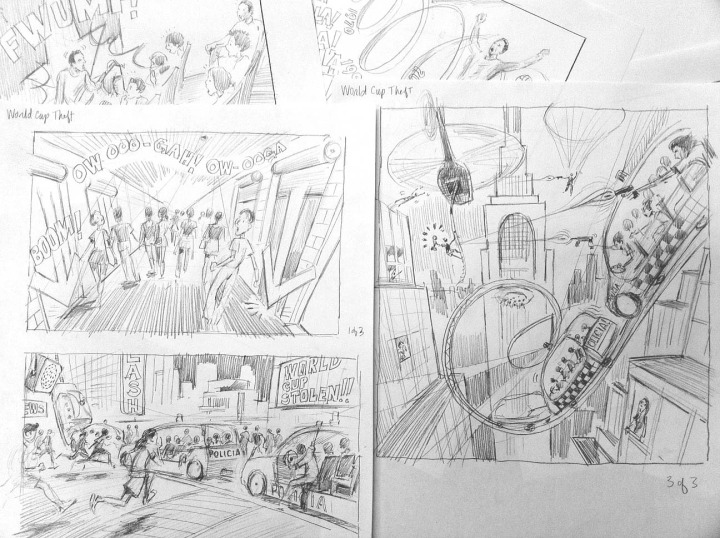
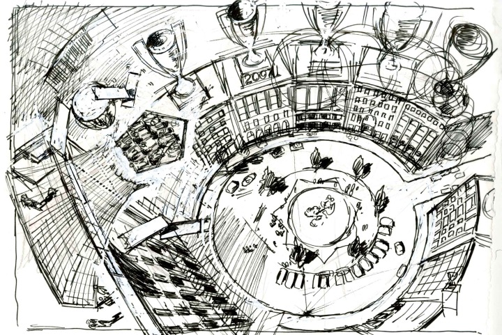
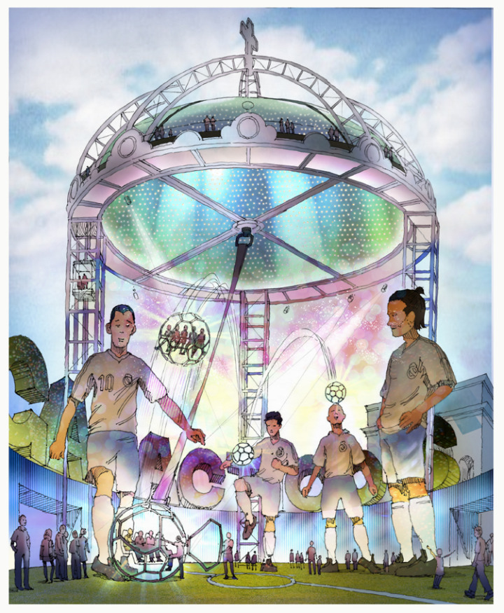
The following sketches for an imaginary theme park were commissioned by one of the world's most famous and enduring sports franchises. (With gratitude to Charles Rush for his excellent work adding Photoshop color to these sketches.)

Appendix: Here are some keywords which will help readers index this article:
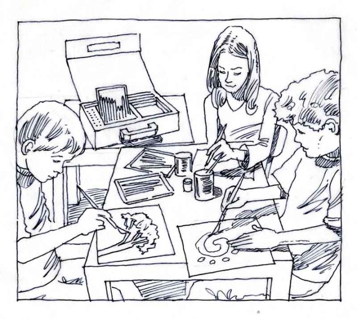
When it comes to explaining your product and architectural concept designs, there is no better storytelling medium than pencil, pen and paper. Pen and ink sketches lend a human touch missing in most presentations, and help differentiate your firm from the nameless competition all using the same digital techniques. Th
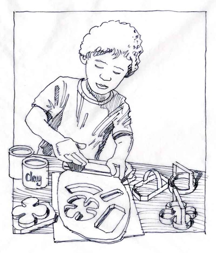

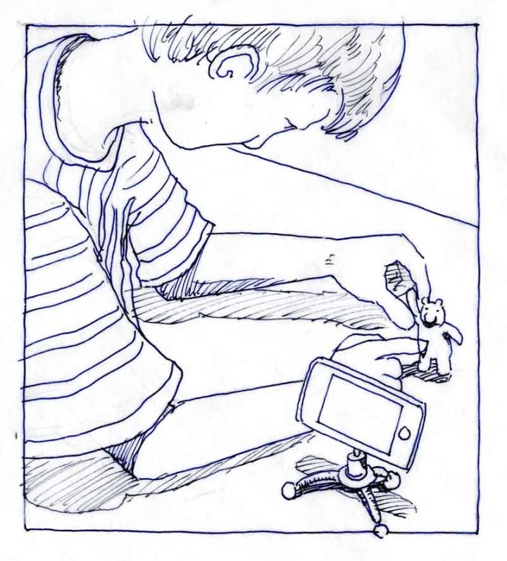
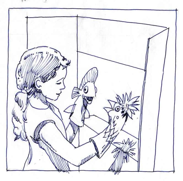
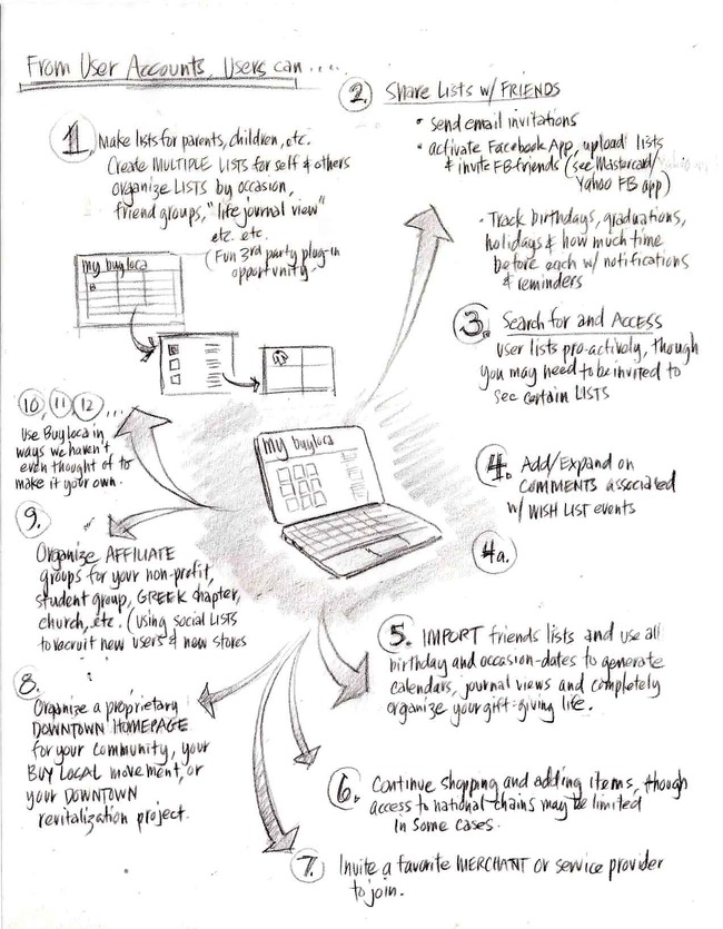
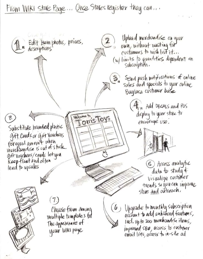
Well, readers, this marks the introduction of the start up mobile and web app that a team of us have been working on for the last year. BuyLOca is 100% intended for the use and benefit of the LOCAL independent businesses who... well, wait, I'll just copy in the press release. Enjoy, and be sure to check out the wireframe diagrams at the end of how the mobile and web app will work.
Press Release, May 21, 2010
from BALLE conference in Charleston, SC
Introducing buyLOca (in beta)...
A Shopper-driven Solution For Sustainable Local Ecommerce
BuyLOca is the mobile (iPhone) and web app that allows shoppers to make photo-based wish lists--tagged with price, location and store name--then share them with friends and family via email and over social networks (because who couldn't use a little help with the 50 gifts--from birthdays to graduations to holidays to housewarming parties that families of four feel "obligated" to exchange every year. Make that 25 for couples without kids.)
BuyLOca is, of course, meant to be a huge convenience for shoppers, but it's also designed to do something VERY cool for local independent merchants and service providers. The magic occurs when buyLOca aggregates shoppers' wish list photos to both users' homepages, and to FREE "wiki" store pages for the local businesses from where items are listed (since 90% of these businesses lack the resources to build their own ecommerce capability and can use the help in competing with malls, big box stores and online retailers!). Bottom line? As shoppers share their wish lists via email and social network: 1) THEY get what they really want from friends and family on gift giving occasions; 2) BUSINESS OWNERS get free ecommerce pages (built spontaneously from their customers' wishes, which turns out to be an efficient and powerful form of online search recommendation engine) and viral word of mouth advertising over customers' social networks, and; 3) the NETWORK EFFECTS create a virtuous cycle and drive even MORE TRAFFIC TO LOCAL BUSINESSES and BUY LOCAL PROGRAMS .
Additionally, as growing numbers of store owners add items and services to their free pages, local goods and services in general become more visible to ORGANIC SEARCH (where according to Forrester Research, an astonishing 90% of all discretionary shopping begins these days), allowing random online shoppers to find the goods they're searching for LOCALLY before they reflexively venture off to malls, big box stores and online retailers. The fact that wish listers and their favorite stores will tend to be in the same area means that buyLOca will also save last minute gift buyers (i.e. all of us) the growing expense of 1-,2- or even 5-day shipping typical of last minute online purchases.
In summary, buyLOca helps--at the scale of the individual online and offline shopper--to make the connections between producers and consumers that the best Buy Local networks seek to make, and SHIFTS a portion of day-to-day shopping--starting with gift buying--back to the local businesses that form the heart and soul of our local communities (and--in striking contrast to the policies of national chains--the supporters of our local Little League teams and High School Musicals:).
Although buyLOca begins as an app that makes gift giving easier, more accurate and more meaningful, its MISSION is to revolutionize local ecommerce and help sustain local economies by: 1) cataloging and uploading local goods and services "one wish list at a time;" 2) encouraging local businesses to upload more of their local goods and services to their free pages, and; 3) laying the foundation for a mobile and web channel that allows a million-plus resource-challenged local businesses to extend the geographic and seasonal markets for their goods and services to a global online and mobile audience.
BuyLOca is looking for communities that would like to help us beta test the service, and for angel investors who would like to be a part of the team working toward a 2010 holiday season launch. Please call Jamie Akers at 413-250-8800 if you wish to help with either. Thank you for your time, and remember, we are in beta, so we invite you to help us make buyLOca better with your suggestions in the comments section.
The following diagrams--though one generation old--give the general idea for how the mobile and web app will work.
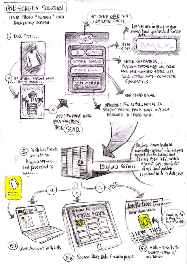


(Note: Welcome to the startup and angel investor community on LinkedIn. Please visit the portfolio portion of this site to see other examples of architectural--building, software or otherwise--visualization techniques.)
Entrepreneurs have a lot on their plates--finding pain points to solve, raising funds, choosing between iPhone, Android, and now iPad platforms, cutting through crowded marketplace noise, etc. Great ideas must elegantly solve pain while being fun to use, hyper-efficient to navigate and joyous to spread. UX (user experience) designers know they're going to lose half of their audience with every click, so making mobile and web apps simple, stunning and "sticky" is job one.
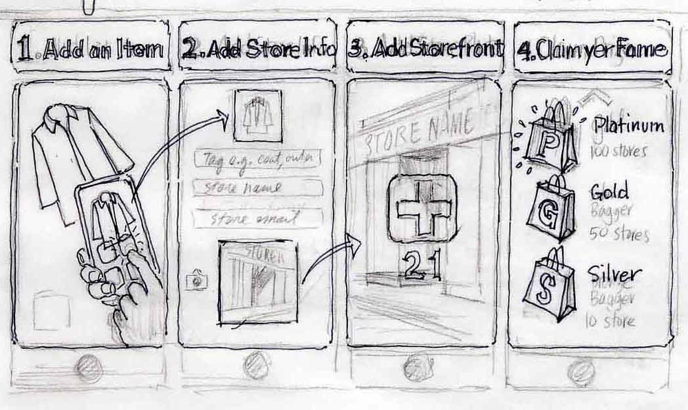
UX design is central to any web 2.0 start up conversation. There are many wireframe programs available to help, but the medium is the message, and these aides tend to make the apps they help create look the same. Why not follow the lead of movie directors and entertainment designers and use storyboards to nucleate your vision, get team members on the same page, and communicate to investors in a striking and company-differentiating way?
Taking the metaphor a bit further, UX design is a lot like set design (see samples included) only your stage is held in the palm of your hand (on your mobile device). Providing examples of storyboarding will be a recurring theme in this blog, beginning with some in-progress and very rough UX sketches for a social mobile start up being developed right here in western Massachusetts. (Yes, western Massachusetts. Afterall, we were home to Bo Peabody and Matt Harris's Tripod, so we can certainly do it again.) These begin as rough pencil sketches made in real-time working with developers around a table, and evolve after many iterations into publishable memes that tell your story. I can't tell you much about the startup idea involved here, but the clever ones among you may figure it out.
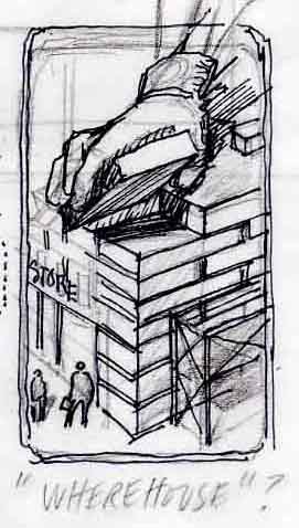
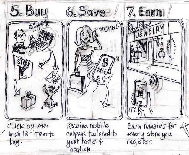
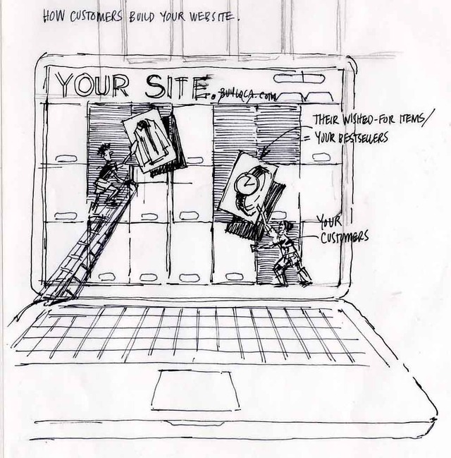
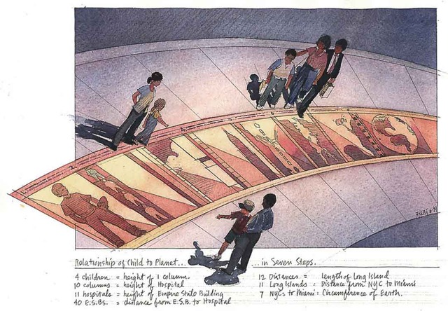
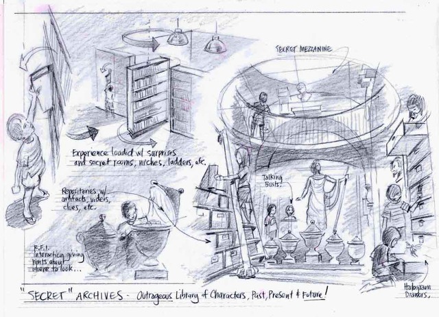
That's it for the UX stuff I can show on this project. Below are a sampling of storyboards made in collaboration with famed set designer/architect David Rockwell, and several other firms doing work in the entertainment industry.

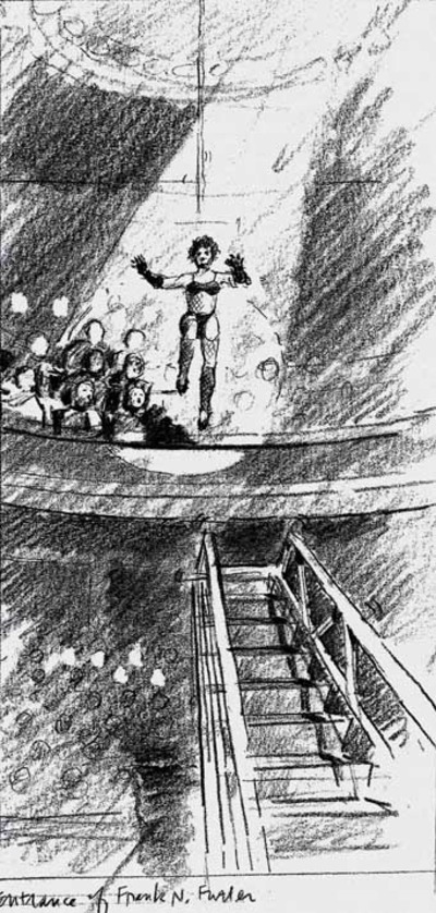
The moment of Frank's Entry in the staged production of Rocky Horror Picture Show.
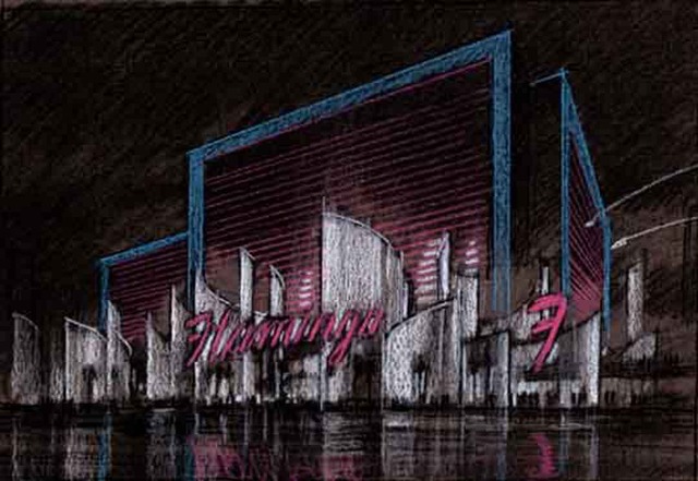
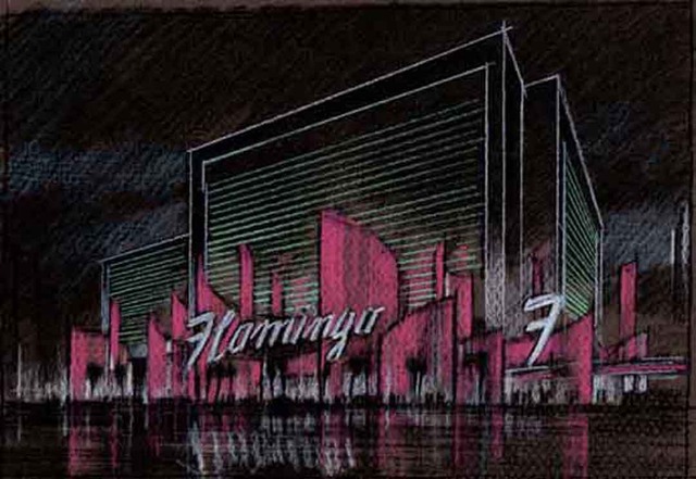
Studies for the "reinvention" of the aging Flamingo Casino in Las Vegas.

Thanks for coming, and please stay tuned for more on how storyboarding can help your startup (or startups if you're an angel investor) focus team effort and get to launch faster.
Appendix: Here are some keywords which will help readers index this article:
architectural rendering
watercolor techniques
architectural renderings
architectural rendering techniques
watercolor rendering techniques
pen and ink techniques
watercolor rendering
watercolor techniques
architectural sketches
watercolor rendering techniques
watercolor techniques
architectural watercolor rendering techniques
pen techniques
different watercolor techniques in rendering
architectural sketching
pen and ink
sketching techniques
architectural rendering in watercolor
rendering watercolor
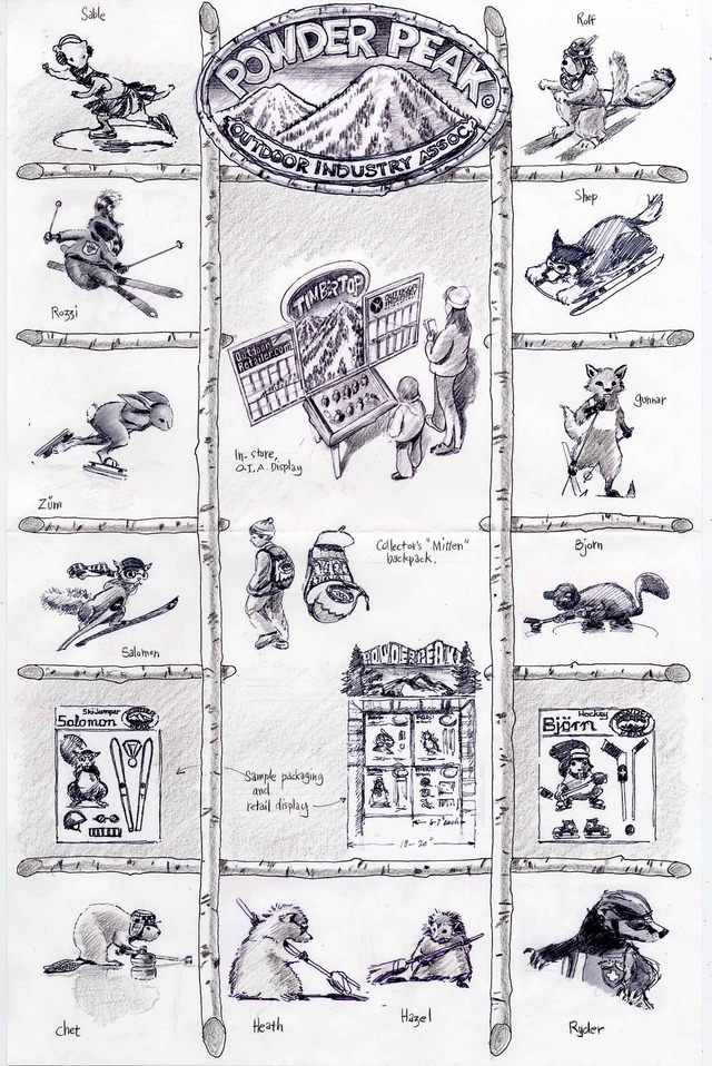
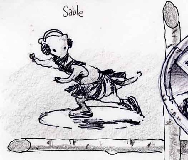
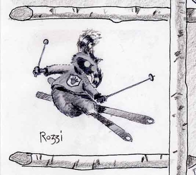
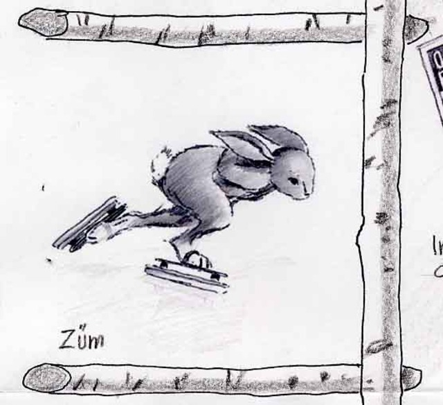
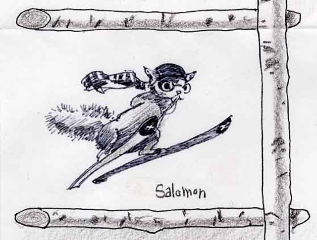
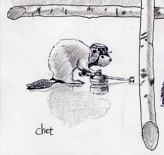
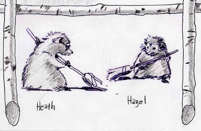
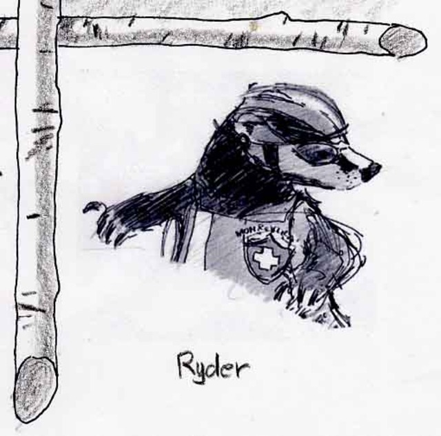
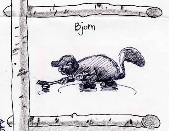
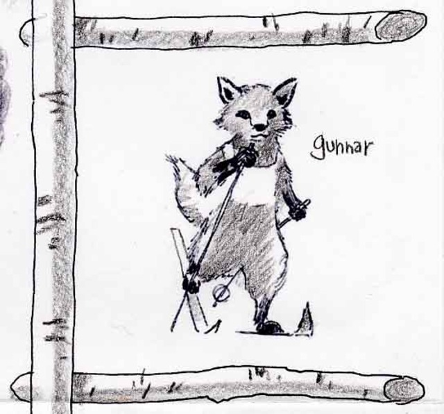
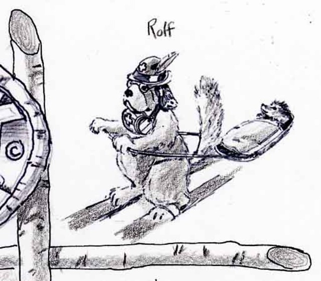
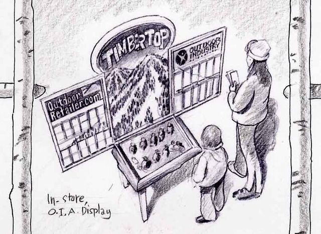
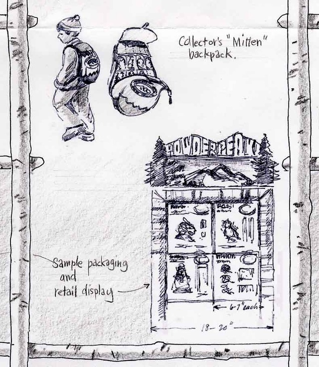
Here's an idea Mary Pat and Spencer had for a line of children's toys based on Olympic Winter and Summer Games. A toy consultant said it was too "Beatrix Potter." (Is that a problem a few iterations wouldn't have solved?) Call me sentimental, but the idea was to reduce the level of "gar-bozh" in the world and get back to something that fostered the imagination. The line was to be placed at POS of ski shops and ski resorts around the world, as option for families looking for alternatives to "more hotel room vacation TV." There's a line for the Summer Olympics, too. As usual, click on any image to make larger.
Dining "Half Off." The Magic That Was Almost The David Copperfield Restaurant In Times Square, NY
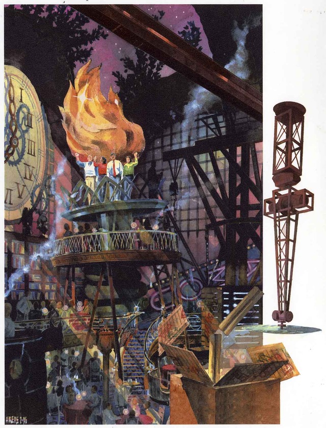
Many years ago I had the pleasure of collaborating with David Rockwell to design (then do the architectural illustrations and 3D visualizations of) a restaurant prototype for David Copperfield, the famous magician. The concept was part of the genre of destination/tourist entertainment restaurants popular at the time, and this one might have been the most entertaining had it happened. Among the many other delights--levitating tables, waiters disappearing in full view of diners, etc.--was the twice-a-night moment when the maitre d' asked for four volunteers who would like to be, um, sawn in half--I kid you not. The following four views show the design we came up with--heavily influenced by Piranesi's "I Carceri"--for that event,. If you look closely, those of you who know him well will recognize my friend Marty Kapell as one of the people about to dine half off. He's the one in the white sweater vest waving atop the Lady Liberte's hand at the end:)


Appendix: Here are some keywords which will help readers index this article:
architectural rendering
watercolor techniques
architectural renderings
architectural rendering techniques
watercolor rendering techniques
pen and ink techniques
watercolor rendering
watercolor techniques
architectural sketches
watercolor rendering techniques
watercolor techniques
architectural watercolor rendering techniques
pen techniques
different watercolor techniques in rendering
architectural sketching
pen and ink
sketching techniques
architectural rendering in watercolor
rendering watercolor
Hop on the waitlist for the Live Draw-Along Workshop and I’ll send you details before anyone else.