Tutorial showing steps in developing a concept for an aquarium in the Dubai Mall. All done in the Procreate sketching, painting and illustration app.
Have Pen Will Travel: Benefits To Architects of In-House 3rd Party Sketching and Rendering
Because You Never Want To Hear The Words “I Wish I’d Known About You Yesterday?!”
How Architects and Interior Designers Can Design Using Procreate on the iPad Pro
How Architects and Interior Designers Can Use the iPad Pro, Episode 2: A Rendering in 4-6 Hours
Simple Residential Designs for Surprising Solutions
Use Digital Architectural Sketching To Streamline Client Approvals
It's one week before your next big design meeting. You have multiple ideas to present, but your goal is to secure your client's approval of a single direction so you can complete this phase, bill for it and move your team on to the next.

Back in the day, architects solved this problem by presenting loose architectural sketches (with maybe a little color thrown on them), blown up several feet wide so as to wow the client with vagueness...but times have changed and clients have changed with them.

Modern clients have grown up in a world of photo-realistic digital images.Their parents understood that hand drawn sketches and diagrams were a part of the design development process, but this generation has
Fast, Low-Cost Architectural Sketches Help Realtors and Prospective Buyers Study Design Options Before Buying
As an architect who specializes in early-stage concept design, architectural sketching and rapid visualization, I get to serve as one-stop shop for realtors, developers and prospective homeowners wanting to study their options before committing to buying an important property, or before engaging a "high profile" architect who, given the pressures of running a large practice, might just assign the exercise to a couple of talented in-house designers anyway.
In the collaboration posted here, I worked with a Boston developer to sketch (in a fraction of the time required by a larger firm) the look and feel of a 120-unit, future-looking condo project in a prosperous Boston suburb.
 Early study based on SketchUp massing study: the Idea of pre-fab, stackable units enters inWe used a combination of traditional and digital architectural rendering techniques to explore her options, culminating in the simple black-and-white digital renderings at the end. Unfortunately, the banking meltdown of 2008 nipped the project in the bud, but...
A Great Book To Read For People Who Love Understanding The Underlying Structure of Things, Including Designers, Architects and Architectural Renderers
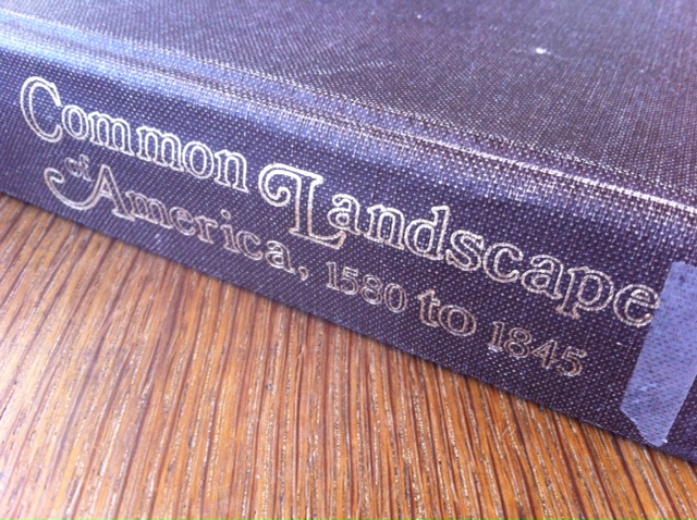 John Stilgoe's Common Landscape of America, 1580 to 1845, is a classic book and required reading of all first year students at the Harvard Graduate School of Design.
John Stilgoe's Common Landscape of America, 1580 to 1845, is a classic book and required reading of all first year students at the Harvard Graduate School of Design. I've got an architectural watercolor rendering to do today (Yay!) so I'll keep my part of this post short, but check out the excerpt below from the chapter on the history of schoolhouses on the subject of a book written by Jedidiah Morse in 1789 called The American Geography.The book was an off-the-charts bestseller which coincided with the growing movement, eventually mandated by the "tyrannical" federal government, to educate all American children in communal schoolhouses, almost always one-room affairs which have a fascinating history relative to where they were built (usually the most central place, or on a piece of waste land donated by a farmer, but almost invariably in the most difficult-to-get-to and foreboding locations within each school district). Due to its fortuitous timing, the book had perhaps a disproportionate influence on the opinions of generations of young Americans, and is even given credit for much of the misinformation which started the California Gold Rush of 1849. As Stilgoe sets it up: "Topographical knowledge no longer only derived from topographical experience: Morse filled his books with maps, charts and lengthy prose descriptions of states, regions, rivers, territories, forests, soils and agricultural and mineral riches...Morse emphasized that his information was scientific and reliable, and schoolmasters commanded students to memorize it. Scholars learned that New Hampshire was filled with mountains and cascades, that North Carolina "abounds with medicinal plants and roots"...and that the Spanish Dominions truly needed American improvement." Now here's where it gets crazy (and racist)...
How Architectural Rendering By Hand Helped Bryant Park Restaurant Get Approvals For New Lighting Design
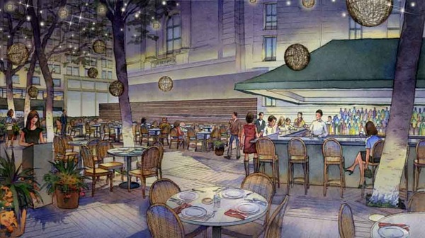
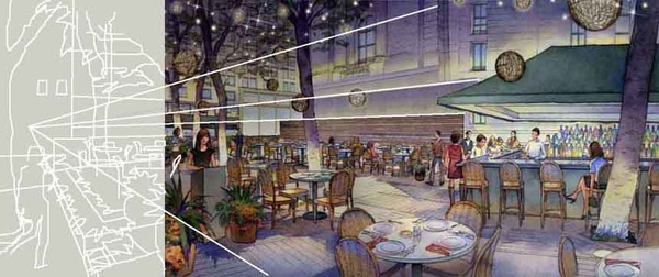
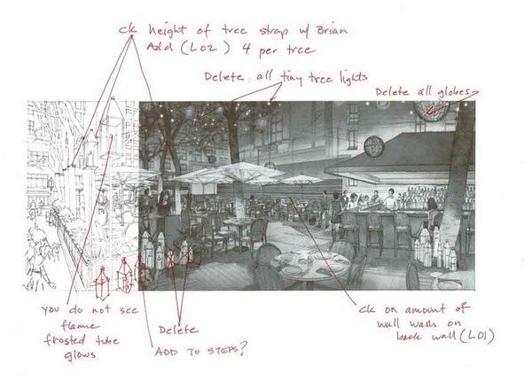
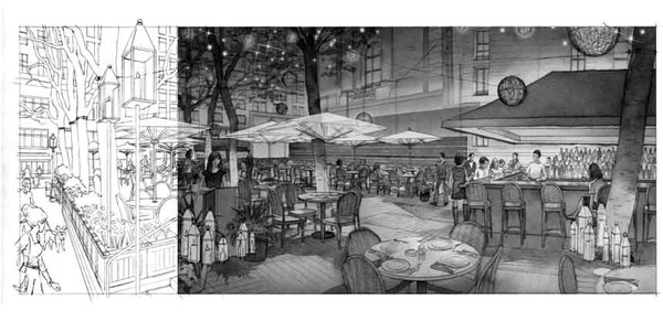
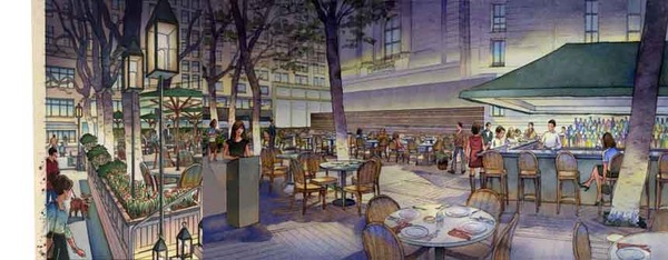
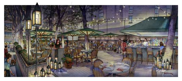
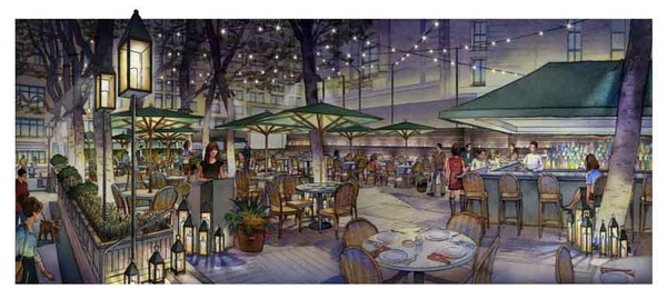
When Ark Restaurants, interior designer Nancy Mah and lighting designer Brian Orter needed a change to an existing rendering of Bryant Park Restaurant to reflect a new lighting design, the answer was to modify the rendering of this cultural landmark to show more of the entrance from Bryant Park. Here is the process we used. Click on any image to enlarge.
Original rendering:
Quick photoshop study of proposed patch:
Notes from the client:
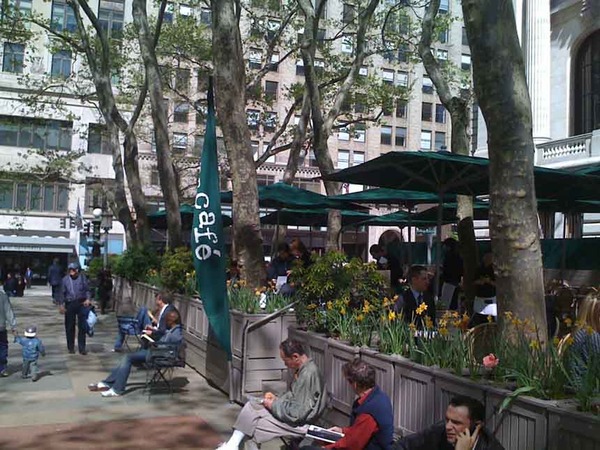
Context photos:
Pencil line drawing of patch:
Watercolored patch added to original in photoshop:
Overhead festoon lighting and additional floor lanterns added in photoshop:
Final version with festoon lights raised.
That was fun, wasn't it? According to the designers, the revised rendering was a hit with the Bryant Park commission.
Appendix: Here are some keywords which will help readers index this article:
- architectural rendering
- watercolor techniques
- architectural renderings
- architectural rendering techniques
- watercolor rendering techniques
- pen and ink techniques
- watercolor rendering
- watercolor techniques
- architectural sketches
- watercolor rendering techniques
- watercolor techniques
- architectural watercolor rendering techniques
- pen techniques
- different watercolor techniques in rendering
- architectural sketching
- pen and ink
- sketching techniques
- architectural rendering in watercolor
- rendering watercolor
A Restaurant For David Copperfield
Dining "Half Off." The Magic That Was Almost The David Copperfield Restaurant In Times Square, NY
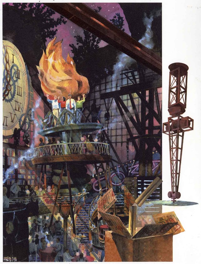
Many years ago I had the pleasure of collaborating with David Rockwell to design (then do the architectural illustrations and 3D visualizations of) a restaurant prototype for David Copperfield, the famous magician. The concept was part of the genre of destination/tourist entertainment restaurants popular at the time, and this one might have been the most entertaining had it happened. Among the many other delights--levitating tables, waiters disappearing in full view of diners, etc.--was the twice-a-night moment when the maitre d' asked for four volunteers who would like to be, um, sawn in half--I kid you not. The following four views show the design we came up with--heavily influenced by Piranesi's "I Carceri"--for that event,. If you look closely, those of you who know him well will recognize my friend Marty Kapell as one of the people about to dine half off. He's the one in the white sweater vest waving atop the Lady Liberte's hand at the end:)


Appendix: Here are some keywords which will help readers index this article:
architectural rendering
watercolor techniques
architectural renderings
architectural rendering techniques
watercolor rendering techniques
pen and ink techniques
watercolor rendering
watercolor techniques
architectural sketches
watercolor rendering techniques
watercolor techniques
architectural watercolor rendering techniques
pen techniques
different watercolor techniques in rendering
architectural sketching
pen and ink
sketching techniques
architectural rendering in watercolor
rendering watercolor
The World's Most Beautiful Buildings: The Chapel At Ronchamp
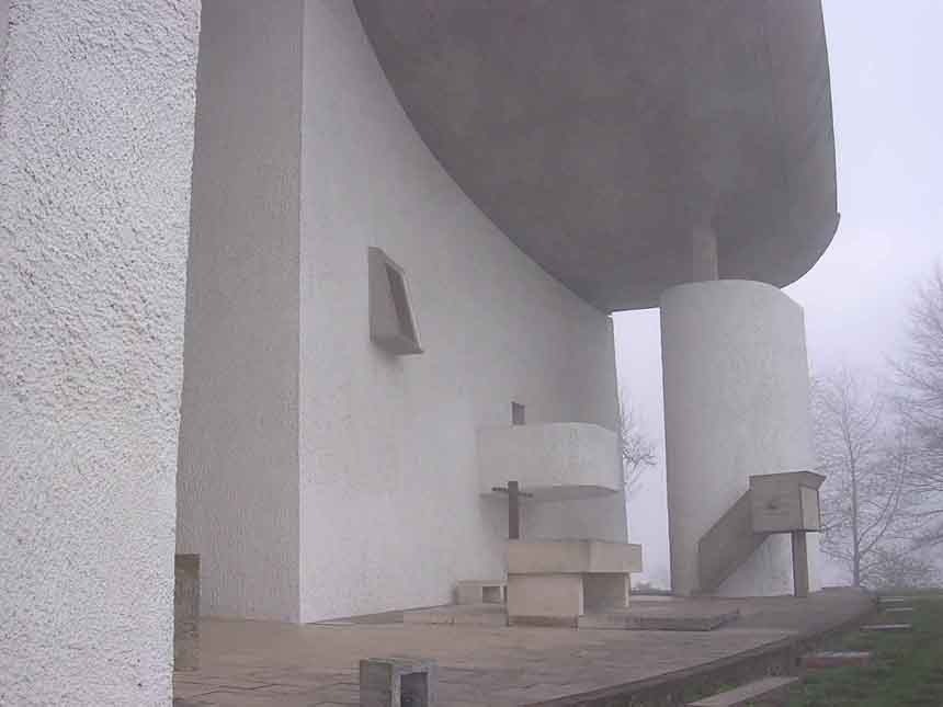
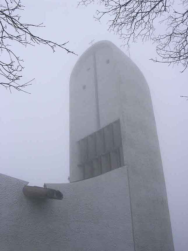
When you grow up wanting to be an architect, you learn about the Chapel at Ronchamp at an early age. It's an icon of modern design, as interpreted by the early 20th century architect Le Corbusier. Corbu and Frank Lloyd Wright were a little bit like Madonna: artists so rich in ideas (Madonna? OK, maybe I went too far, but you get the point) that they were capable of remaining ahead of trends they themselves ironically created, reinventing themselves and opening up new veins of ideas in their art several times over their careers.
Ronchamp represents a late stage in Corbu's career when, like many poets, he began to see beauty in traditions and forms he might have held in contempt during his revolutionary youth. The building is based on a traditional plan, but it's striking forms are pure modern invention, some say based on a nun's hat.
We went to see the place at the end of a trip to visit Spence in Leysin, Switzerland, during his junior year of high school at the American School of Leysin. I walked around taking these exterior photos, then went inside.
Given the expectations set by the exterior, one is kind of shocked by the intimacy of the interior. One discovers the acoustics are insane. One gets the uncontrollable urge to do a Gregorian chant.
Did any of you have a memorable experience visiting Ronchamp? I'm hoping none of you say "Yeh, one time I was there and this douchebag was singing inside."
Even though I make my living doing architectural watercolor renderings, and architectural rendering, watercolor techniques, pen and ink techniques, watercolor rendering techniques and architectural rendering techniques, I still want to go back to doing architectural design someday. There's nothing like the feeling of creating a building.


