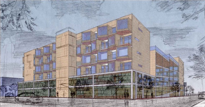
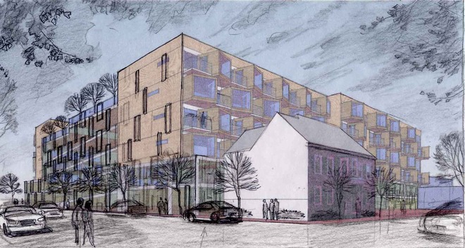
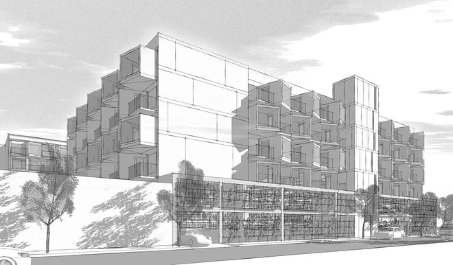
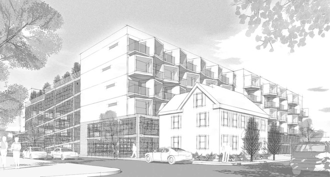
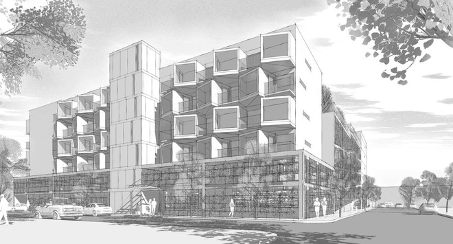
In Part One below, we saw the beginning of an architectural idea: stackable, pre-fab units that come together in a way that animates building and neighborhood. The series of images below follows the thread of that design through to the final black-and-white digital renderings.
Bitt, you may be asking yourself why an architect who does traditional pencil and watercolor architectural rendering would present final images of his own design in a black-and-white digital style-especially given that architect's thoughts on the shortcomings of digital rendering. In this case we were looking for a dispassionate style which combined the strengths of digital modeling (real-time navigation as we pitched the project to the Planning Board) with the charms of the pencil sketch.
Anyone else find ways to combine digital rendering and traditional rendering tools to save time and money in the architectural rendering process? Stew? Chip? Dale? Mark? Tom? Bill? Vic? Leave your comments, lads. As always, click on images to enjoy detail.
