We've talked quite a bit about hybrid architectural renderings in this blog. A hybrid architectural rendering is any rendering that mixes traditional and digital techniques so as to leverage the best characteristics of both.

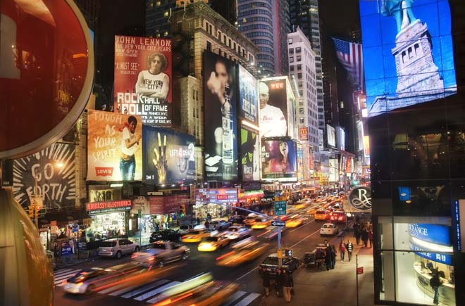
So what does this photograph of Times Square have to do with a blog post about hybrid architectural rendering? Read on and you shall see.
Traditional architectural rendering, as the argument goes, communicates at some deep level in the human brain, connecting people--even against their will, Don Draper might say--with emotions still stirred by handmade artifacts, as in a handmade drawing or painting.
Digital architectural rendering techniques, on the other hand, brings advantages no human artifact can compete with: the illusion of photo-realism; the advantages of infinite visual adjustment in very little time, and my favorite: the element of surprise.

Is it me, or did I just use one of the easiest things you can do in photoshop to turn a fairly standard sketch of a proposed hotel lobby into something more interesting than my human hand could have created on its own?
Surprise in two ways: surprise in the viewer--or let's say the viewer's lizard brain--when the two forms of architectural rendering are combined. This surprise takes the form of the "Oh...cool?!?" remark.

But then there's the second form of surprise--my favorite: the surprise in the artist when mixing the two forms of architectural rendering creates a sense of play and new discovery that may have slowly become lost over the course of a long week, or even a long career.

Let's face it. Traditional architectural rendering is hard work, especially architectural rendering in watercolor. I am always amazed when my friends and incredibly talented colleagues talk about how much they love doing watercolor, while I'm like, are you kidding me? Is there anything worse than facing your insecurities 8 hours a day, wondering if the colored juice you're slopping around on top of a pristine piece of handmade (there's that word again) watercolor paper will end up looking like something good enough to charge thousands of dollars for? I mean, come on, let's be honest--it's terrifying!

Want to be blown away, dear reader? Go take a look at the work of Steve Parker, or Dick Sneary, or Bill Hook, or Frank Costantino, or Elizabeth Day, or Stephanie Bower. You have already seen the miraculous work of Clark Smith and Tom Schaller. These people are talented! These people have watercolor running in their veins, and it spills out of them effortlessly, whereas it pretty much takes a flood followed by a fire on a coffee plantation (you see what I did there?) to get me started on a new watercolor architectural rendering (just ask the client who is unwittingly waiting for me to stop procrastinating by writing this blog post and get to work on his watercolor).

But ask me to do any kind of hybrid architectural rendering that allows me to combine my love for traditional architectural illustration with the sense of surprise I feel when I get to mix photoshop with a traditional architectural rendering, and I'm your man.

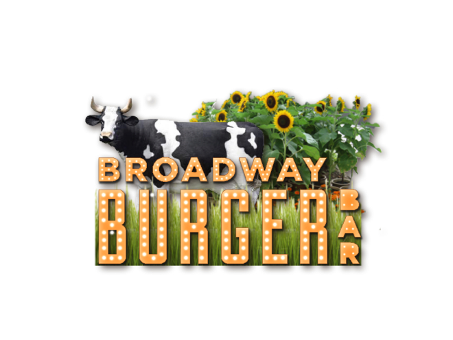
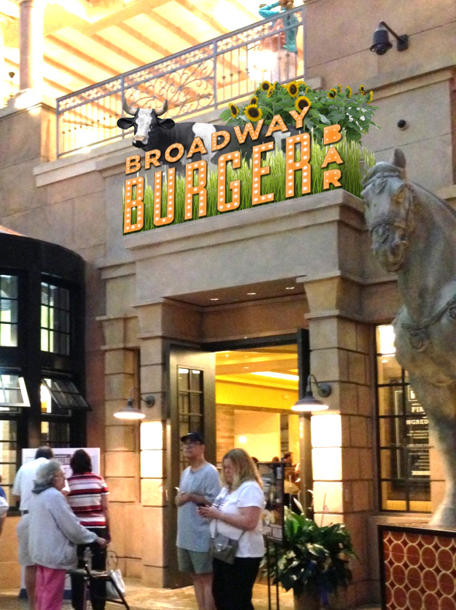
Ask me to combine a sign made out of channel letters you found in a coffee shop on the Lower East Side with a happy looking cow and sunflowers growing in a meadow, and then make a convincing-enough architectural rendering showing that sign hoisted above the entrance of a new restaurant in a casino in Atlantic City, and you've made my day.

Not quite sure how we got from a new hotel being proposed for the famous Brill building in Times Square to the Burger Bar restaurant in Atlantic City, but you see what I mean about surprise. Fun, huh?
(Author James Akers is a registered architect and freelance traditional architectural renderer who collaborates with some of the world's most admired architects and business entrepreneurs to create inspired architectural designs, house portraits and architectural renderings in all media, including watercolor, pen and ink, pencil, photoshop and computer. He may be reached directly at 413-250-8800)