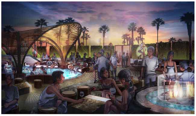
Architects have had to be resourceful since the bankers brought the global economy to its knees in 2008. I mean, we taxpayers with jobs couldn't let the bankers starve, could we? Still, after we shared our own after-tax income to save these valuable executives and restore their bonuses, architects (and a few other professions) had the problem of finding work to replace that income. (OK, I'm being silly here. Nothing said the rest of us had to maintain our lifestyles or send our kids to college.) That's when we began re-inventing ourselves: finding new clients, downsizing our firms, exploring more efficient ways to deliver services and get the ball rolling again.

My thanks to my friend Chad Rush for his help in coloring this puppy
One of the ways that architectural renderers have reinvented themselves is to blend the world of traditional architectural rendering with digital architectural rendering, resulting in the so-called hybrid architectural rendering. Some argue that the hybrid architectural rendering combines the best of both into a compelling new form that connects the work with the emotions of the client and helps architects differentiate themselves from the pack. Others just think it looks cool and gives the client more options to quickly explore a mood or time of day.

Here is the original pencil tone drawing of a proposed nightclub terrace in Las Vegas. (Architect's name withheld by request)
Whatever your opinion, I hope you will... enjoy the following images showing the progress of two recent hybrid renderings which combine the hand-drawn warmth of traditional architectural rendering with... the flexibility and excitement of digital architectural rendering.

This drawing shows how the final composition begins--as a hand-drawn image inventing people having fun (because gosh knows it's challenging to find digital files of people in just the right position)

The above line drawing is then toned in pencil to establish the direction and mood of the lighting designed by the architect, in this case the frikking awesome Vi...oops, forgot I can't say yet.

And so begins the coloring in Photoshop, working with the tone drawing as the main layer underneath


This is one of my favorite stages, and in fact some hybrid architectural renderings never go beyond this phase, laying the artifice bare in a very funky way


The clever ones among you will notice that the client changed the sky from the previous phase. Since I am reasonably certain no one is reading this blog, I will admit that I kind of preferred the colors and composition of the previous phase.

This phase may look no different than the last, but can you tell what has changed? Go ahead...take a minute. Yes!! You're right. Skin tones have been added. Isn't it amazing what a difference this makes?


I just love hybrid architectural rendering. And I just love working with my buddy Chad Rush. So now it's your turn. Give us a call
(Author James Akers is a registered architect and freelance digital and traditional architectural renderer who collaborates with some of the world's most admired architects and business entrepreneurs to create inspired architectural designs, house portraits and architectural renderings in all media, including watercolor, pen and ink, pencil, photoshop and computer. He may be reached directly at 413-250-8800)