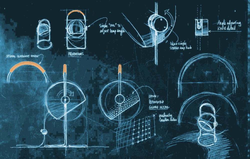
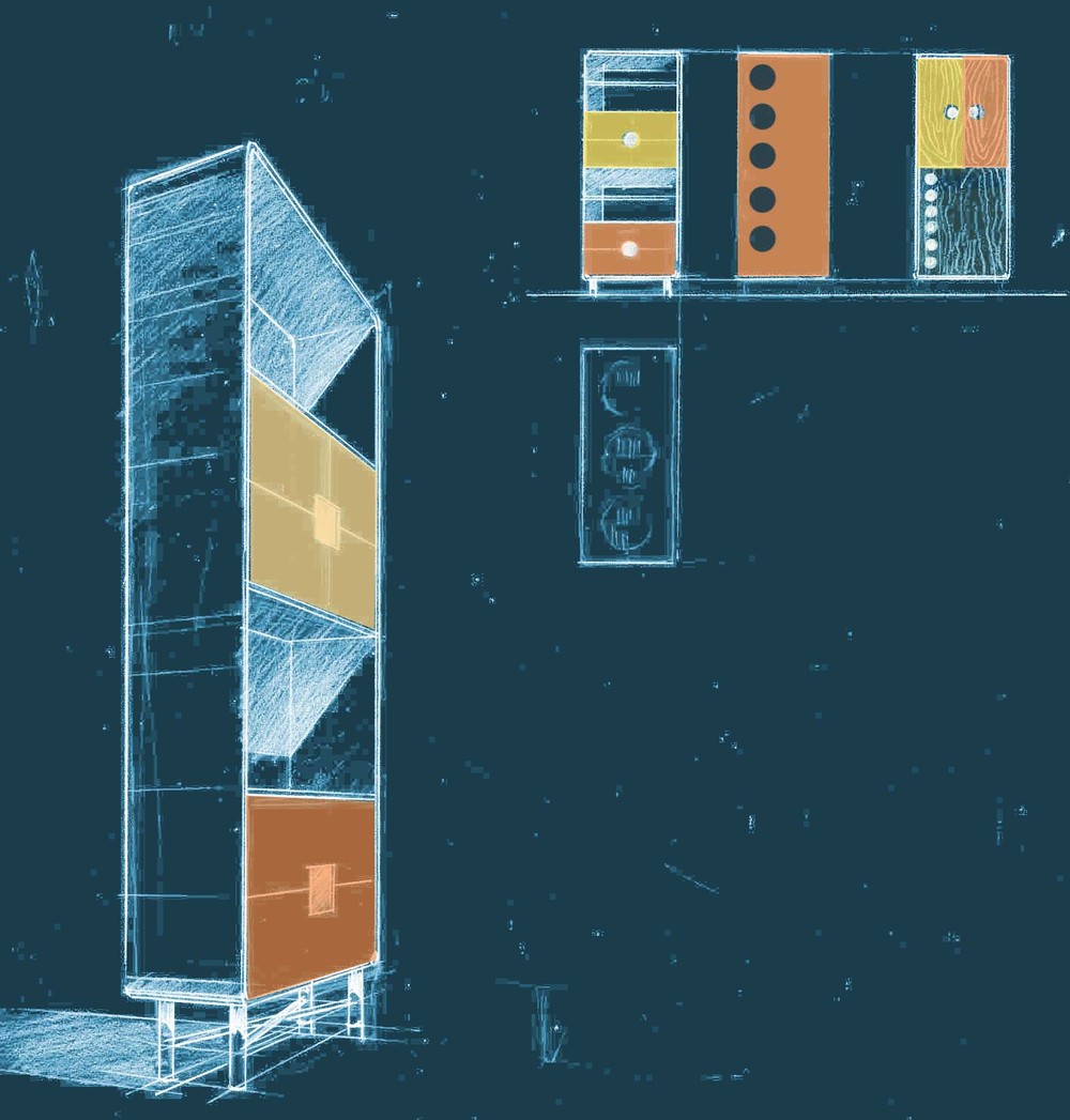
There is somethng visually powerful about the look of old school blueprints. To many of us over 40, white lines on a deep blue background say "architecture" and design like nothing else. Not that one wishes to re-live the past, but it just so happens that photoshop makes it remarkably easy to recreate that look. The product design sketches below illustrate this process.

In this example, the architectural rendering and product design client is a famous startup associated with a great American city that has seen finer days. That city is, to a great degree, relying on startups like the one in question to... bootstrap itself up from its post-industrial ashes.

The designer whose product design ideas I am helping to illustrate--one of today's most original and influential American architects--was asked to help the client re-interpret iconic furniture and lighting designs of the 30s, 40s, 50s and 60s.

The sketches don't show specific designs--it's too early in the process for that--but rather were made as a kind of visual stenography, recording the earliest conversations between client and designer.
The photoshop rendering technique used to re-create the look of the old school "blueprint" era is as follows:
Scan pencil rendering in color mode at 150 dpi
Image > Levels > (adjust to taste, with emphasis on texture and imperfections in sketch)
Image > Adjustments > Invert
Layer > New adjustment layer > Hue and Saturation
Click on "Colorize"
Set Hue at 198, Saturation at 48 and Lightness at 12 to 20 (depending on taste)

This architectural rendering and product design sketch shows the original before the photoshop rendering technique was created.

(Author James Akers is a registered architect and architectural illustrator with over 25 years experience. His YouTube Procreate tutorial channel has thousands of subscribers (please join us!), and he provides both in-house and studio-based sketching and rendering—what one might call "design stenography" services—to many of NYC's and Boston’s leading architects.)
